Back
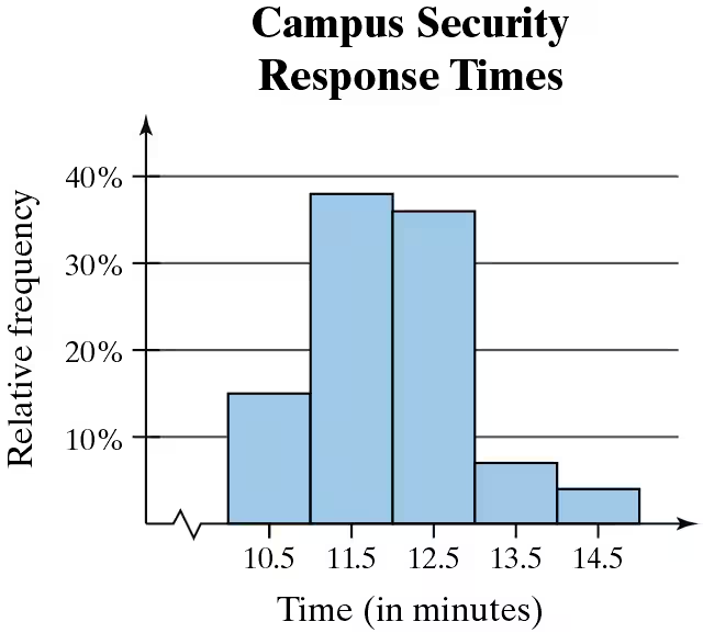
BackProblem 2.1.24c
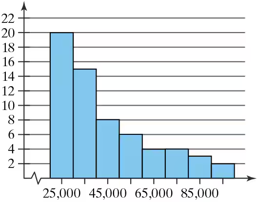
Use the relative frequency histogram to describe any patterns with the data.
Problem 2.1.37
Constructing a Frequency Distribution and a Relative Frequency Histogram In Exercises 37–40, construct a frequency distribution and a relative frequency histogram for the data set using five classes. Which class has the greatest relative frequency and which has the least relative frequency?
Taste Test
Data set: Ratings from 1 (lowest) to 10 (highest) provided by 36 people after taste-testing a new flavor of protein bar 2 6 9 2 9 9 6 10 5 8 7 6 5 10 1 4 9 3 4 5 3 6 5 2 4 9 2 9 3 3 6 5 1 9 4 2
Problem 2.1.41
Construct a cumulative frequency distribution and an ogive for the data set using six classes. Then describe the location of the greatest increase in frequency.
Retirement Ages
Data set: Retirement ages of 35 English professors 72 62 55 61 53 62 65 66 69 55 66 63 67 69 55 65 67 57 67 68 73 75 65 54 71 57 52 58 58 71 72 67 63 65 61
Problem 2.1.45a
What Would You Do? You work at a bank and are asked to recommend the amount of cash to put in an ATM each day. You do not want to put in too much (which would cause security concerns) or too little (which may create customer irritation). The daily withdrawals (in hundreds of dollars) for 30 days are listed. 72 84 61 76 104 76 86 92 80 88 98 76 97 82 84 67 70 81 82 89 74 73 86 81 85 78 82 80 91 83
Construct a relative frequency histogram for the data. Use 8 classes.
Problem 2.1.30
Construct a frequency distribution for the data set using the indicated number of classes. In the table, include the midpoints, relative frequencies, and cumulative frequencies. Which class has the greatest class frequency and which has the least class frequency.
Textbook Spending
Number of classes: 6
Data set: Amounts (in dollars) spent on textbooks for a semester 91 472 279 249 530 376 188 341 266 199 142 273 189 130 489 266 248 101 375 486 190 398 188 269 43 30 127 354 84 319
Problem 2.1.33
Construct a frequency distribution and a frequency histogram for the data set using the indicated number of classes. Describe any patterns.
Reaction Times
Number of classes: 8
Data set: Reaction times (in milliseconds) of 30 adult females to an auditory stimulus 507 389 305 291 336 310 514 442 373 428 387 454 323 441 388 426 411 382 320 450 309 416 359 388 307 337 469 351 422 413
Problem 2.1.10
Determine whether the statement is true or false. If it is false, rewrite it as a true statement.
Class boundaries ensure that consecutive bars of a histogram touch.
Problem 2.1.19a
Use the frequency histogram
a. to determine the number of classes.
Problem 2.1.19d
Use the frequency histogram
d. describe any patterns with the data..
Problem 2.1.20d
Use the frequency histogram
describe any patterns with the data..
Problem 2.1.23b
Use the relative frequency histogram to
approximate the greatest and least relative frequencies.
Problem 2.2.5
Putting Graphs in Context In Exercises 5–8, match the plot with the description of the sample.
a. Times (in minutes) it takes a sample of employees to drive to work
b. Grade point averages of a sample of students with finance majors
c. Top speeds (in miles per hour) of a sample of high-performance sports cars
d. Ages (in years) of a sample of residents of a retirement home
Problem 2.2.8
Putting Graphs in Context In Exercises 5–8, match the plot with the description of the sample.
a. Times (in minutes) it takes a sample of employees to drive to work
b. Grade point averages of a sample of students with finance majors
c. Top speeds (in miles per hour) of a sample of high-performance sports cars
d. Ages (in years) of a sample of residents of a retirement home
Problem 2.2.12
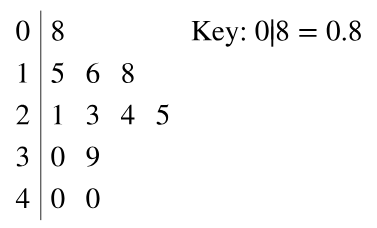
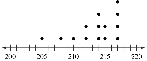
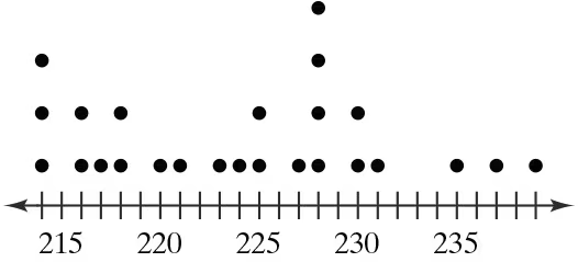
Graphical Analysis In Exercises 9–12, use the stem-and-leaf plot or dot plot to list the actual data entries. What is the maximum data entry? What is the minimum data entry?
Problem 2.2.15
Using and Interpreting Concepts
Graphical Analysis In Exercises 13–16, give three observations that can be made from the graph.
Problem 2.2.18
Graphing Data Sets In Exercises 17–32, organize the data using the indicated type of graph. Describe any patterns.
Nursing Use a stem-and-leaf plot to display the data, which represent the number of hours 24 nurses work per week.
40 40 35 48 38 40 36 50 32 36 40 35
30 24 40 36 40 36 40 39 33 40 32 38
Problem 2.2.21
Graphing Data Sets In Exercises 17–32, organize the data using the indicated type of graph. Describe any patterns.
Highest-Paid Athletes Use a stem-and-leaf plot that has two rows for each stem to display the data, which represent the incomes (in millions) of the top 30 highest-paid athletes. (Source: Forbes Media LLC)
39 42 41 45 48 48 106 45 88 54 61 37 62 74 40
47 56 57 105 96 37 48 41 64 52 47 45 59 49 104
Problem 2.2.24
Graphing Data Sets In Exercises 17–32, organize the data using the indicated type of graph. Describe any patterns.
Life Spans of Houseflies Use a dot plot to display the data, which represent the life spans (in days) of 30 houseflies.
9 9 4 11 10 5 13 9 7 11 6 8 14 10 6
10 10 7 14 11 7 8 6 13 10 14 14 8 13 10
Problem 2.2.27
Graphing Data Sets In Exercises 17–32, organize the data using the indicated type of graph. Describe any patterns.
Smartphone Sales The five best-selling smartphone manufacturers of 2020 were Apple (206.1 million units), Huawei (189.0 million units), Samsung (266.7 million units), vivo (111.7 million units), and Xiaomi (147.8 million units). Use a Pareto chart to display the data. (Source: International Data Corporation)
Problem 2.2.34
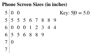
Phone Screen Sizes Display the data below in a dot plot. Describe the differences in how the stem-and-leaf plot and the dot plot show patterns in the data.
Problem 2.2.31
Graphing Data Sets In Exercises 17–32, organize the data using the indicated type of graph. Describe any patterns.
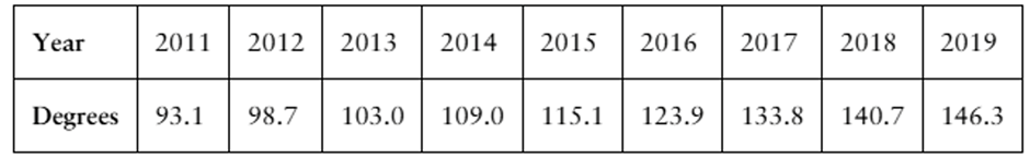
Engineering Degrees Use a time series chart to display the data shown in the table. The data represent the number of bachelor’s degrees in engineering (in thousands) conferred in the U.S. (Source: U.S. Deapartment of Education)
Problem 2.2.37
Extending Concepts
A Misleading Graph? A misleading graph is not drawn appropriately, which can misrepresent data and lead to false conclusions. In Exercises 37–40, (a) explain why the graph is misleading, and (b) redraw the graph so that it is not misleading.
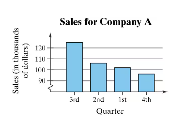
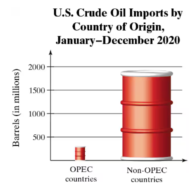
Problem 2.2.40
Extending Concepts
A Misleading Graph? A misleading graph is not drawn appropriately, which can misrepresent data and lead to false conclusions. In Exercises 37–40, (a) explain why the graph is misleading, and (b) redraw the graph so that it is not misleading.
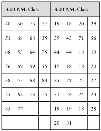
Problem 2.2.42a
Yoga Classes The data sets at the left show the ages of all participants in two yoga classes.
a. Make a back-to-back stem-and-leaf plot as described in Exercise 41 to display the data.
Problem 2.2.54a
Shifting Data Sample annual salaries (in thousands of dollars) for employees at a company are listed.
40 35 49 53 38 39 40
37 49 34 38 43 47 35
a. Find the sample mean and the sample standard deviation.
Problem 2.3.62d
Extending Concepts
Golf The distances (in yards) for nine holes of a golf course are listed.
336 393 408 522 147 504 177 375 360
d. Use your results from part (c) to explain how to quickly find the mean and the median of the original data set when the distances are converted to inches.
Problem 2.3.62b
Extending Concepts
Golf The distances (in yards) for nine holes of a golf course are listed.
336 393 408 522 147 504 177 375 360
b. Convert the distances to feet. Then rework part (a).
Problem 2.3.62c
Extending Concepts
Golf The distances (in yards) for nine holes of a golf course are listed.
336 393 408 522 147 504 177 375 360
c. Compare the measures you found in part (b) with those found in part (a). What do you notice?
Problem 2.3.14
Matching In Exercises 13–16, match the distribution with one of the graphs in Exercises 9–12. Justify your decision.
The frequency distribution of mileages of service vehicles at a business where a few vehicles have much higher mileages than the majority of vehicles
Problem 2.3.9
Graphical Analysis In Exercises 9–12, determine whether the approximate shape of the distribution in the histogram is symmetric, uniform, skewed left, skewed right, or none of these. Justify your answer.