Using the table below, which category would appear first in a Pareto Chart representing the data?
Table of contents
- 1. Intro to Stats and Collecting Data1h 14m
- 2. Describing Data with Tables and Graphs1h 56m
- 3. Describing Data Numerically2h 5m
- 4. Probability2h 16m
- 5. Binomial Distribution & Discrete Random Variables3h 6m
- 6. Normal Distribution and Continuous Random Variables2h 11m
- 7. Sampling Distributions & Confidence Intervals: Mean3h 23m
- Sampling Distribution of the Sample Mean and Central Limit Theorem19m
- Distribution of Sample Mean - Excel23m
- Introduction to Confidence Intervals15m
- Confidence Intervals for Population Mean1h 18m
- Determining the Minimum Sample Size Required12m
- Finding Probabilities and T Critical Values - Excel28m
- Confidence Intervals for Population Means - Excel25m
- 8. Sampling Distributions & Confidence Intervals: Proportion2h 10m
- 9. Hypothesis Testing for One Sample5h 8m
- Steps in Hypothesis Testing1h 6m
- Performing Hypothesis Tests: Means1h 4m
- Hypothesis Testing: Means - Excel42m
- Performing Hypothesis Tests: Proportions37m
- Hypothesis Testing: Proportions - Excel27m
- Performing Hypothesis Tests: Variance12m
- Critical Values and Rejection Regions28m
- Link Between Confidence Intervals and Hypothesis Testing12m
- Type I & Type II Errors16m
- 10. Hypothesis Testing for Two Samples5h 37m
- Two Proportions1h 13m
- Two Proportions Hypothesis Test - Excel28m
- Two Means - Unknown, Unequal Variance1h 3m
- Two Means - Unknown Variances Hypothesis Test - Excel12m
- Two Means - Unknown, Equal Variance15m
- Two Means - Unknown, Equal Variances Hypothesis Test - Excel9m
- Two Means - Known Variance12m
- Two Means - Sigma Known Hypothesis Test - Excel21m
- Two Means - Matched Pairs (Dependent Samples)42m
- Matched Pairs Hypothesis Test - Excel12m
- Two Variances and F Distribution29m
- Two Variances - Graphing Calculator16m
- 11. Correlation1h 24m
- 12. Regression3h 33m
- Linear Regression & Least Squares Method26m
- Residuals12m
- Coefficient of Determination12m
- Regression Line Equation and Coefficient of Determination - Excel8m
- Finding Residuals and Creating Residual Plots - Excel11m
- Inferences for Slope31m
- Enabling Data Analysis Toolpak1m
- Regression Readout of the Data Analysis Toolpak - Excel21m
- Prediction Intervals13m
- Prediction Intervals - Excel19m
- Multiple Regression - Excel29m
- Quadratic Regression15m
- Quadratic Regression - Excel10m
- 13. Chi-Square Tests & Goodness of Fit2h 21m
- 14. ANOVA2h 28m
2. Describing Data with Tables and Graphs
Bar Graphs and Pareto Charts
Problem 2.2.40
Textbook Question
Extending Concepts
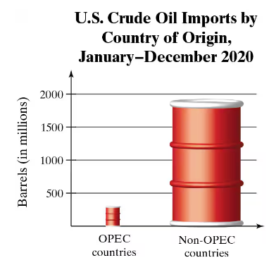
A Misleading Graph? A misleading graph is not drawn appropriately, which can misrepresent data and lead to false conclusions. In Exercises 37–40, (a) explain why the graph is misleading, and (b) redraw the graph so that it is not misleading.

 Verified step by step guidance
1
Analyze the graph: The graph compares U.S. crude oil imports from OPEC countries and non-OPEC countries using barrel icons. The size of the barrels is disproportionate to the actual data values, which can visually exaggerate the difference between the two categories.
Explain why the graph is misleading: The barrel icons are scaled in both height and width, making the visual difference appear much larger than the actual numerical difference. This violates the principle of proportional representation in graphs, as the area of the barrels does not correspond to the data values.
Redraw the graph: To make the graph accurate, use a standard bar graph where the height of the bars is proportional to the data values. Ensure that the y-axis is labeled clearly and scaled appropriately to represent the range of values.
Label the axes and provide context: Clearly label the x-axis with 'Country of Origin' and the y-axis with 'Barrels (in millions).' Include a title that accurately describes the data, such as 'U.S. Crude Oil Imports by Country of Origin, 2020.'
Verify proportionality: Ensure that the visual representation of the data (e.g., bar heights) matches the numerical values provided. This will prevent misinterpretation and allow viewers to draw accurate conclusions from the graph.
 Verified video answer for a similar problem:
This video solution was recommended by our tutors as helpful for the problem above
Video duration:
1mPlay a video:
0 Comments
Key Concepts
Here are the essential concepts you must grasp in order to answer the question correctly.
Misleading Graphs
A misleading graph is one that presents data in a way that can distort the truth or lead to incorrect interpretations. This can occur through inappropriate scaling, selective data presentation, or visual exaggeration. For instance, if the height of bars in a bar graph is not proportional to the values they represent, it can mislead viewers about the actual differences between categories.
Recommended video:

Creating Time-Series Graphs
Bar Graphs
Bar graphs are visual representations of data that use rectangular bars to show the quantity of different categories. The length or height of each bar corresponds to the value it represents, making it easy to compare different groups. Properly designed bar graphs should have consistent scales and clear labels to ensure accurate interpretation of the data.
Recommended video:

Creating Bar Graphs and Pareto Charts
Data Representation
Data representation refers to the methods used to visually display data, which can significantly influence how information is perceived. Effective data representation should accurately reflect the underlying data without distortion. This includes using appropriate scales, maintaining proportionality, and ensuring clarity, which helps viewers draw valid conclusions from the presented information.
Recommended video:

Introduction to Collecting Data

 4:52m
4:52mWatch next
Master Creating Bar Graphs and Pareto Charts with a bite sized video explanation from Patrick
Start learningRelated Videos
Related Practice
Multiple Choice
