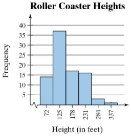
Graphical Analysis In Exercises 9–12, determine whether the approximate shape of the distribution in the histogram is symmetric, uniform, skewed left, skewed right, or none of these. Justify your answer.
Table of contents
- 1. Intro to Stats and Collecting Data1h 14m
- 2. Describing Data with Tables and Graphs1h 55m
- 3. Describing Data Numerically2h 5m
- 4. Probability2h 16m
- 5. Binomial Distribution & Discrete Random Variables3h 6m
- 6. Normal Distribution and Continuous Random Variables2h 11m
- 7. Sampling Distributions & Confidence Intervals: Mean3h 23m
- Sampling Distribution of the Sample Mean and Central Limit Theorem19m
- Distribution of Sample Mean - Excel23m
- Introduction to Confidence Intervals15m
- Confidence Intervals for Population Mean1h 18m
- Determining the Minimum Sample Size Required12m
- Finding Probabilities and T Critical Values - Excel28m
- Confidence Intervals for Population Means - Excel25m
- 8. Sampling Distributions & Confidence Intervals: Proportion1h 12m
- 9. Hypothesis Testing for One Sample3h 29m
- 10. Hypothesis Testing for Two Samples4h 50m
- Two Proportions1h 13m
- Two Proportions Hypothesis Test - Excel28m
- Two Means - Unknown, Unequal Variance1h 3m
- Two Means - Unknown Variances Hypothesis Test - Excel12m
- Two Means - Unknown, Equal Variance15m
- Two Means - Unknown, Equal Variances Hypothesis Test - Excel9m
- Two Means - Known Variance12m
- Two Means - Sigma Known Hypothesis Test - Excel21m
- Two Means - Matched Pairs (Dependent Samples)42m
- Matched Pairs Hypothesis Test - Excel12m
- 11. Correlation1h 6m
- 12. Regression1h 50m
- 13. Chi-Square Tests & Goodness of Fit1h 57m
- 14. ANOVA1h 57m
2. Describing Data with Tables and Graphs
Histograms
Problem 2.1.20d
Textbook Question
Use the frequency histogram
describe any patterns with the data..

Verified step by step guidance1
Step 1: Observe the histogram and identify the key components. The x-axis represents the height of roller coasters (in feet), divided into intervals, while the y-axis represents the frequency (number of roller coasters) within each height interval.
Step 2: Note the distribution of the data. The histogram shows that the majority of roller coasters fall within the height range of 125 to 178 feet, as this interval has the highest frequency (approximately 40).
Step 3: Identify any patterns or trends. The data appears to be skewed to the right, as the frequency decreases for higher height intervals (231-284 feet and beyond). This suggests that taller roller coasters are less common.
Step 4: Consider the spread of the data. The heights range from 72 feet to 337 feet, indicating a wide variety of roller coaster heights. However, most roller coasters are concentrated in the lower height intervals.
Step 5: Summarize the findings. The histogram indicates that roller coasters are most commonly built within the height range of 125 to 178 feet, with fewer roller coasters at extreme heights. This could reflect design or safety considerations in roller coaster construction.
Verified video answer for a similar problem:This video solution was recommended by our tutors as helpful for the problem above
Video duration:
2mPlay a video:
Was this helpful?
Key Concepts
Here are the essential concepts you must grasp in order to answer the question correctly.
Frequency Histogram
A frequency histogram is a graphical representation of data that shows the frequency of data points within specified ranges, or bins. Each bar's height indicates the number of observations that fall within that range, allowing for a visual interpretation of the distribution of the data. In this case, the histogram displays the heights of roller coasters, making it easy to identify which height ranges are most common.
Recommended video:
Guided course
Intro to Histograms
Central Tendency
Central tendency refers to the statistical measures that describe the center of a data set, commonly represented by the mean, median, and mode. In the context of the histogram, the mode is particularly relevant as it indicates the height range with the highest frequency, which is 125 feet in this case. Understanding central tendency helps in summarizing the data and identifying typical values.
Recommended video:
Guided course
Calculating the Mean
Data Distribution Patterns
Data distribution patterns refer to the way data points are spread across different values, which can reveal trends, clusters, or gaps in the data. Analyzing the histogram can help identify whether the data is normally distributed, skewed, or has outliers. In this histogram, the concentration of roller coasters around 125 feet suggests a common height preference, while the tapering off at higher heights indicates fewer roller coasters at those elevations.
Recommended video:
Guided course
Visualizing Qualitative vs. Quantitative Data
Related Videos
Related Practice
Textbook Question
