Back
BackProblem 2.3.17
Using and Interpreting Concepts
Finding and Discussing the Mean, Median, and Mode In Exercises 17–34, find the mean, the median, and the mode of the data, if possible. If any measure cannot be found or does not represent the center of the data, explain why.
College Credits The number of credits being taken by a sample of 14 full-time college students for a semester
12 14 16 15 13 14 15
18 16 16 12 16 15 17
Problem 2.3.31
Using and Interpreting Concepts
Finding and Discussing the Mean, Median, and Mode In Exercises 17–34, find the mean, the median, and the mode of the data, if possible. If any measure cannot be found or does not represent the center of the data, explain why.
Weights (in pounds) of Packages on a Delivery Truck
Problem 2.3.3
Building Basic Skills and Vocabulary
True or False? In Exercises 1– 4, determine whether the statement is true or false. If it is false, rewrite it as a true statement.
A data set can have the same mean, median, and mode.
Problem 2.2.21
Graphing Data Sets In Exercises 17–32, organize the data using the indicated type of graph. Describe any patterns.
Highest-Paid Athletes Use a stem-and-leaf plot that has two rows for each stem to display the data, which represent the incomes (in millions) of the top 30 highest-paid athletes. (Source: Forbes Media LLC)
39 42 41 45 48 48 106 45 88 54 61 37 62 74 40
47 56 57 105 96 37 48 41 64 52 47 45 59 49 104
Problem 2.3.22
Using and Interpreting Concepts
Finding and Discussing the Mean, Median, and Mode In Exercises 17–34, find the mean, the median, and the mode of the data, if possible. If any measure cannot be found or does not represent the center of the data, explain why.
Cholesterol The cholesterol levels of a sample of 10 female employees
154 240 171 188 235 203 184 173 181 275
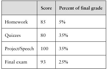
Problem 2.3.41
Finding a Weighted Mean In Exercises 41– 46, find the weighted mean of the data.
Final Grade The scores and their percents of the final grade for a statistics student are shown below. What is the student’s mean score?
Problem 2.2.8
Putting Graphs in Context In Exercises 5–8, match the plot with the description of the sample.
a. Times (in minutes) it takes a sample of employees to drive to work
b. Grade point averages of a sample of students with finance majors
c. Top speeds (in miles per hour) of a sample of high-performance sports cars
d. Ages (in years) of a sample of residents of a retirement home
Problem 2.4.20
Salary Offers You are applying for jobs at two companies. Company C offers starting salaries with μ = $59,000 and σ = $1500. Company D offers starting salaries with μ = $59,000 and σ = $1000. From which company are you more likely to get an offer of $62,000 or more? Explain your reasoning.
Problem 2.5.24
Using Technology to Find Quartiles and Draw Graphs In Exercises 23–26, use technology to draw a box-and-whisker plot that represents the data set.
Vacation Days The number of vacation days used by a sample of 20 employees in a recent year
3 9 2 1 7 5 3 2 2 6
4 0 10 0 3 5 7 8 6 5
Problem 2.5.44
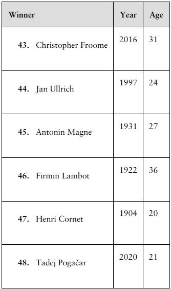
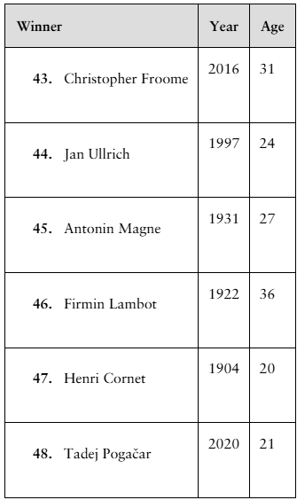
Finding z-Scores The distribution of the ages of the winners of the Tour de France from 1903 to 2020 is approximately bell-shaped. The mean age is 27.9 years, with a standard deviation of 3.4 years. In Exercises 43–48, use the corresponding z-score to determine whether the age is unusual. Explain your reasoning. (Source: Le Tour de France)
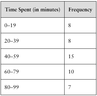
Problem 2.3.50
Finding the Mean of a Frequency Distribution In Exercises 49–52, approximate the mean of the frequency distribution.
Social Media The average daily amounts of time (in minutes) spent on Snapchat
Problem 2.2.18
Graphing Data Sets In Exercises 17–32, organize the data using the indicated type of graph. Describe any patterns.
Nursing Use a stem-and-leaf plot to display the data, which represent the number of hours 24 nurses work per week.
40 40 35 48 38 40 36 50 32 36 40 35
30 24 40 36 40 36 40 39 33 40 32 38
Problem 2.5.35
Finding a Percentile In Exercises 33–36, use the data set, which represents the ages of 30 executives.
43 57 65 47 57 41 56 53 61 54
56 50 66 56 50 61 47 40 50 43
54 41 48 45 28 35 38 43 42 44
Which ages are above the 75th percentile?
Problem 2.5.26
Using Technology to Find Quartiles and Draw Graphs In Exercises 23–26, use technology to draw a box-and-whisker plot that represents the data set.
Hourly Earnings The hourly earnings (in dollars) of a sample of 21 employees at a consulting firm
25.89 27.09 31.76 28.28 26.19 27.43 24.06
25.61 22.56 29.76 18.01 23.66 38.24 37.27
32.70 31.12 25.87 15.06 23.12 30.62 19.85
Problem 2.4.13
In Exercises 13 and 14, find the range, mean, variance, and standard deviation of the population data set.
Drunk Driving The number of alcohol-impaired crash fatalities (in thousands) per year from 2010 through 2019 (Source: National Highway Traffic Safety Administration)
10.1 9.9 10.3 10.1 9.9 10.3 11.0 10.9 10.7 10.1
Problem 2.3.19
Using and Interpreting Concepts
Finding and Discussing the Mean, Median, and Mode In Exercises 17–34, find the mean, the median, and the mode of the data, if possible. If any measure cannot be found or does not represent the center of the data, explain why.
Video Durations The lengths (in minutes) of seven educational videos from the Public Broadcasting Service (PBS) (Source: PBS)
83 67 90 55 56 119 52
Problem 2.1.10
Determine whether the statement is true or false. If it is false, rewrite it as a true statement.
Class boundaries ensure that consecutive bars of a histogram touch.
Problem 2.1.36
Constructing a Frequency Distribution and a Frequency Polygon In Exercises 35 and 36, construct a frequency distribution and a frequency polygon for the data set using the indicated number of classes. Describe any patterns.
Declaration of Independence
Number of classes: 5
Data set: Number of children of those who signed the Declaration of Independence (Source: The U.S. National Archives & Records Administration) 5 2 12 18 7 4 10 8 16 3 3 7 3 1 2 7 13 0 8 3 7 5 2 6 0 6 7 9 0 11 9 10 7 8 13 5 8 3 5 0 3 13 3 15 5 6 3 2 5 2 0 3 7 12 4 1
Problem 2.5.38
Finding and Interpreting Percentiles In Exercises 37– 40, use the data set, which represents wait times (in minutes) for various services at a state’s Department of Motor Vehicles locations.
6 10 1 22 23 10 6 7 2 1 6 6 2 4 14 15 16 4
19 3 19 26 5 3 4 7 6 10 9 10 20 18 3 20 10 13
14 11 14 17 4 27 4 8 4 3 26 18 21 1 3 3 5 5
Which wait time represents the 50th percentile? How would you interpret this?
Problem 2.4.45
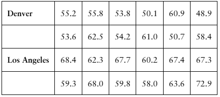
Comparing Variation in Different Data Sets In Exercises 45–50, find the coefficient of variation for each of the two data sets. Then compare the results.
Annual Salaries Sample annual salaries (in thousands of dollars) for entry level architects in Denver, CO, and Los Angeles, CA, are listed.
Problem 2.5.1
Building Basic Skills and Vocabulary
The length of a guest lecturer’s talk represents the third quartile for talks in a guest lecture series. Make an observation about the length of the talk.
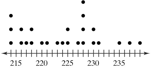
Problem 2.3.37
In Exercises 37– 40, without performing any calculations, determine which measure of central tendency best represents the graphed data. Explain your reasoning.
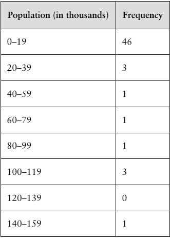
Problem 2.3.52
Finding the Mean of a Frequency Distribution In Exercises 49–52, approximate the mean of the frequency distribution.
Populations The populations (in thousands) of the counties in Montana in 2019 (Source: U.S. Census Bureau)
Problem 2.4.23
Graphical Analysis In Exercises 21–24, you are asked to compare three data sets.
(c) Estimate the sample standard deviations. Then determine how close each of your estimates is by finding the sample standard deviations.
i.
ii.
iii.
Problem 2.5.47
Finding z-Scores The distribution of the ages of the winners of the Tour de France from 1903 to 2020 is approximately bell-shaped. The mean age is 27.9 years, with a standard deviation of 3.4 years. In Exercises 43–48, use the corresponding z-score to determine whether the age is unusual. Explain your reasoning. (Source: Le Tour de France)
Problem 2.1.37
Constructing a Frequency Distribution and a Relative Frequency Histogram In Exercises 37–40, construct a frequency distribution and a relative frequency histogram for the data set using five classes. Which class has the greatest relative frequency and which has the least relative frequency?
Taste Test
Data set: Ratings from 1 (lowest) to 10 (highest) provided by 36 people after taste-testing a new flavor of protein bar 2 6 9 2 9 9 6 10 5 8 7 6 5 10 1 4 9 3 4 5 3 6 5 2 4 9 2 9 3 3 6 5 1 9 4 2
Problem 2.1.3
What is the difference between class limits and class boundaries?
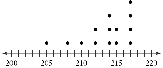
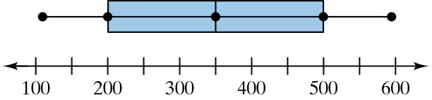
Problem 2.5.22
Graphical Analysis In Exercises 19–22, use the box-and-whisker plot to determine whether the shape of the distribution represented is symmetric, skewed left, skewed right, or none of these. Justify your answer.
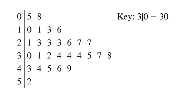
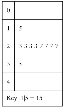
Problem 2.2.12
Graphical Analysis In Exercises 9–12, use the stem-and-leaf plot or dot plot to list the actual data entries. What is the maximum data entry? What is the minimum data entry?
Problem 2.4.25
Constructing Data Sets In Exercises 25–28, construct a data set that has the given statistics.
N = 6
μ = 5
σ ≈ 2