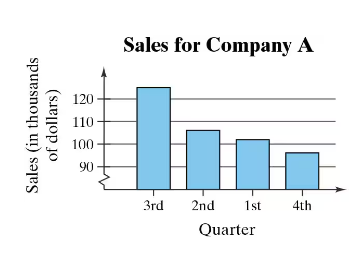
Here are the essential concepts you must grasp in order to answer the question correctly.
Misleading Graphs
A misleading graph is one that distorts the data it represents, often through inappropriate scaling, selective data presentation, or visual exaggeration. Such graphs can lead viewers to incorrect interpretations or conclusions about the data. For example, if the y-axis does not start at zero, it can exaggerate differences between data points, making trends appear more dramatic than they are.
Recommended video:
Creating Time-Series Graphs
Bar Graphs
Bar graphs are visual representations of data where individual bars represent different categories or groups. The height or length of each bar correlates with the value it represents, making it easy to compare quantities. However, the design of bar graphs must be clear and proportional to accurately convey the information; otherwise, they can mislead the audience.
Recommended video:
Creating Bar Graphs and Pareto Charts
Data Representation
Data representation refers to the methods used to visually display data, such as graphs, charts, and tables. Effective data representation should accurately reflect the underlying data and allow for easy interpretation. When creating visualizations, it is crucial to consider factors like scale, labeling, and context to ensure that the audience can draw valid conclusions from the presented information.
Recommended video:
Introduction to Collecting Data