Back
BackProblem 2.5.41
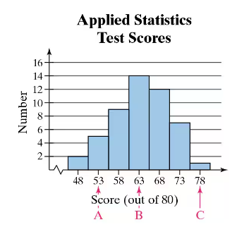
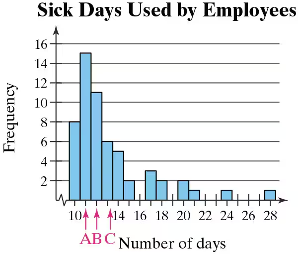
Graphical Analysis In Exercises 41 and 42, the midpoints A, B, and C are marked on the histograms at the left. Match them with the indicated z-scores. Which z-scores, if any, would be considered unusual?
z = 0, z = 2.14, z = −1.43
Problem 2.2.8
Putting Graphs in Context In Exercises 5–8, match the plot with the description of the sample.
a. Times (in minutes) it takes a sample of employees to drive to work
b. Grade point averages of a sample of students with finance majors
c. Top speeds (in miles per hour) of a sample of high-performance sports cars
d. Ages (in years) of a sample of residents of a retirement home
Problem 2.2.12
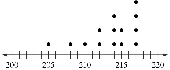
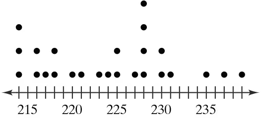
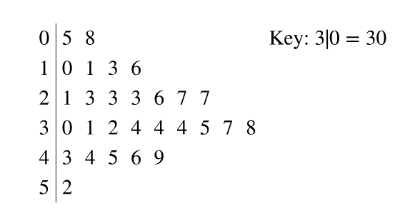
Graphical Analysis In Exercises 9–12, use the stem-and-leaf plot or dot plot to list the actual data entries. What is the maximum data entry? What is the minimum data entry?
Problem 2.5.53
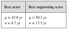
Comparing z-Scores from Different Data Sets The table shows population statistics for the ages of Best Actor and Best Supporting Actor winners at the Academy Awards from 1929 to 2020. The distributions of the ages are approximately bell-shaped. In Exercises 51–54, compare the z-scores for the actors.
Best Actor 1970: John Wayne, Age: 62
Best Supporting Actor 1970: Gig Young, Age: 56
Problem 2.2.24
Graphing Data Sets In Exercises 17–32, organize the data using the indicated type of graph. Describe any patterns.
Life Spans of Houseflies Use a dot plot to display the data, which represent the life spans (in days) of 30 houseflies.
9 9 4 11 10 5 13 9 7 11 6 8 14 10 6
10 10 7 14 11 7 8 6 13 10 14 14 8 13 10
Problem 2.3.17
Using and Interpreting Concepts
Finding and Discussing the Mean, Median, and Mode In Exercises 17–34, find the mean, the median, and the mode of the data, if possible. If any measure cannot be found or does not represent the center of the data, explain why.
College Credits The number of credits being taken by a sample of 14 full-time college students for a semester
12 14 16 15 13 14 15
18 16 16 12 16 15 17
Problem 2.3.31
Using and Interpreting Concepts
Finding and Discussing the Mean, Median, and Mode In Exercises 17–34, find the mean, the median, and the mode of the data, if possible. If any measure cannot be found or does not represent the center of the data, explain why.
Weights (in pounds) of Packages on a Delivery Truck
Problem 2.1.33
Construct a frequency distribution and a frequency histogram for the data set using the indicated number of classes. Describe any patterns.
Reaction Times
Number of classes: 8
Data set: Reaction times (in milliseconds) of 30 adult females to an auditory stimulus 507 389 305 291 336 310 514 442 373 428 387 454 323 441 388 426 411 382 320 450 309 416 359 388 307 337 469 351 422 413
Problem 2.5.60
Modified Box-and-Whisker Plot In Exercises 59–62, (a) identify any outliers and (b) draw a modified box-and-whisker plot that represents the data set. Use asterisks (*) to identify outliers.
75 78 80 75 62 72 74 75 80 95 76 72
Problem 2.4.23
Graphical Analysis In Exercises 21–24, you are asked to compare three data sets.
(c) Estimate the sample standard deviations. Then determine how close each of your estimates is by finding the sample standard deviations.
i.
ii.
iii.
Problem 2.2.18
Graphing Data Sets In Exercises 17–32, organize the data using the indicated type of graph. Describe any patterns.
Nursing Use a stem-and-leaf plot to display the data, which represent the number of hours 24 nurses work per week.
40 40 35 48 38 40 36 50 32 36 40 35
30 24 40 36 40 36 40 39 33 40 32 38
Problem 2.1.13
use the given information about the data set and the number of classes to find the class width, the lower class limits, and the upper class limits.
min=17, range=118, 8 classes
Problem 2.1.35
Constructing a Frequency Distribution and a Frequency Polygon In Exercises 35 and 36, construct a frequency distribution and a frequency polygon for the data set using the indicated number of classes. Describe any patterns.
Ages of the Presidents Number of classes: 7 Data set: Ages of the U.S. presidents at Inauguration (Source: The White House) 57 61 57 57 58 57 61 54 68 51 49 64 50 48 65 52 56 46 54 49 51 47 55 55 54 42 51 56 55 51 54 51 60 62 43 55 56 61 52 69 64 46 54 47 70 78
Problem 2.1.6
What is the difference between a frequency polygon and an ogive?
Problem 2.3.41
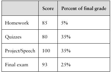
Finding a Weighted Mean In Exercises 41– 46, find the weighted mean of the data.
Final Grade The scores and their percents of the final grade for a statistics student are shown below. What is the student’s mean score?
Problem 2.5.10
True or False? In Exercises 7–10, determine whether the statement is true or false. If it is false, rewrite it as a true statement.
It is impossible to have a z-score of 0.
Problem 2.2.34
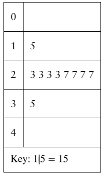
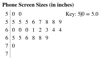
Phone Screen Sizes Display the data below in a dot plot. Describe the differences in how the stem-and-leaf plot and the dot plot show patterns in the data.
Problem 2.3.14
Matching In Exercises 13–16, match the distribution with one of the graphs in Exercises 9–12. Justify your decision.
The frequency distribution of mileages of service vehicles at a business where a few vehicles have much higher mileages than the majority of vehicles
Problem 2.2.37
Extending Concepts
A Misleading Graph? A misleading graph is not drawn appropriately, which can misrepresent data and lead to false conclusions. In Exercises 37–40, (a) explain why the graph is misleading, and (b) redraw the graph so that it is not misleading.
Problem 2.5.44
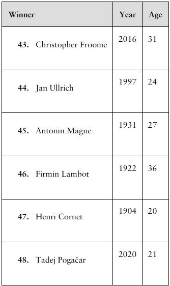
Finding z-Scores The distribution of the ages of the winners of the Tour de France from 1903 to 2020 is approximately bell-shaped. The mean age is 27.9 years, with a standard deviation of 3.4 years. In Exercises 43–48, use the corresponding z-score to determine whether the age is unusual. Explain your reasoning. (Source: Le Tour de France)
Problem 2.5.24
Using Technology to Find Quartiles and Draw Graphs In Exercises 23–26, use technology to draw a box-and-whisker plot that represents the data set.
Vacation Days The number of vacation days used by a sample of 20 employees in a recent year
3 9 2 1 7 5 3 2 2 6
4 0 10 0 3 5 7 8 6 5
Problem 2.5.13
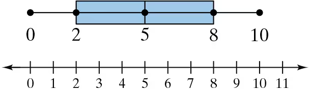
Graphical Analysis In Exercises 13 and 14, use the box-and-whisker plot to identify the five-number summary.
Problem 2.3.59
Graphical Analysis In Exercises 59 and 60, the letters A, B, and C are marked on the horizontal axis. Describe the shape of the data. Then determine which is the mean, which is the median, and which is the mode. Justify your answers.
Problem 2.4.6
Building Basic Skills and Vocabulary
Given a data set, how do you know whether to calculate σ or s?
Problem 2.1.37
Constructing a Frequency Distribution and a Relative Frequency Histogram In Exercises 37–40, construct a frequency distribution and a relative frequency histogram for the data set using five classes. Which class has the greatest relative frequency and which has the least relative frequency?
Taste Test
Data set: Ratings from 1 (lowest) to 10 (highest) provided by 36 people after taste-testing a new flavor of protein bar 2 6 9 2 9 9 6 10 5 8 7 6 5 10 1 4 9 3 4 5 3 6 5 2 4 9 2 9 3 3 6 5 1 9 4 2
Problem 2.CR.15a
Tail lengths (in feet) for a sample of American alligators are listed.
6.5 3.4 4.2 7.1 5.4 6.8 7.5 3.9 4.6
a. Find the mean, median, and mode of the tail lengths. Which best describes a typical American alligator tail length? Explain your reasoning.
Problem 2.CR.6b
The mean annual salary for a sample of electrical engineers is $86,500, with a standard deviation of $1500. The data set has a bell-shaped distribution.
b. The salaries of three randomly selected electrical engineers are $93,500, $85,600, and $82,750. Find the z-score that corresponds to each salary. Determine whether any of these salaries are unusual.
Problem 2.DS.2a
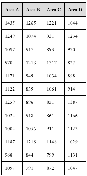
You are a member of your local apartment association. The association represents rental housing owners and managers who operate residential rental property throughout the greater metropolitan area. Recently, the association has received several complaints from tenants in a particular area of the city who feel that their monthly rental fees are much higher compared to other parts of the city.
You want to investigate the rental fees. You gather the data shown in the table at the right. Area A represents the area of the city where tenants are unhappy about their monthly rents. The data represent the monthly rents paid by a random sample of tenants in Area A and three other areas of similar size. Assume all the apartments represented are approximately the same size with the same amenities.
a. What type of graph would you choose to display the data? Explain your reasoning.
Problem 2.DS.2c
You are a member of your local apartment association. The association represents rental housing owners and managers who operate residential rental property throughout the greater metropolitan area. Recently, the association has received several complaints from tenants in a particular area of the city who feel that their monthly rental fees are much higher compared to other parts of the city.
You want to investigate the rental fees. You gather the data shown in the table at the right. Area A represents the area of the city where tenants are unhappy about their monthly rents. The data represent the monthly rents paid by a random sample of tenants in Area A and three other areas of similar size. Assume all the apartments represented are approximately the same size with the same amenities.
c. Based on your data displays, does it appear that the monthly rents in Area A are higher than the rents in the other areas of the city? Explain.
Problem 2.Q.6a
Refer to the sample statistics from Exercise 5 and determine whether any of the house prices below are unusual. Explain your reasoning.
a. $225,000