Here are the essential concepts you must grasp in order to answer the question correctly.
Pareto Chart
A Pareto chart is a type of bar graph that represents the frequency or impact of problems in a descending order. It is based on the Pareto principle, which states that roughly 80% of effects come from 20% of causes. In the context of smartphone sales, a Pareto chart can visually highlight which manufacturers dominate the market, allowing for quick identification of the most significant contributors to total sales.
Recommended video:
Creating Bar Graphs and Pareto Charts
Data Organization
Data organization involves structuring data in a way that makes it easier to analyze and interpret. This can include sorting data, categorizing it, or using specific types of graphs to represent it visually. For the smartphone sales data, organizing the figures into a Pareto chart helps to clearly illustrate the relative sales volumes of each manufacturer, facilitating pattern recognition and comparison.
Recommended video:
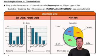
Visualizing Qualitative vs. Quantitative Data
Pattern Recognition
Pattern recognition in data analysis refers to the ability to identify trends, correlations, or anomalies within a dataset. By examining the Pareto chart of smartphone sales, one can observe which manufacturers are leading in sales and how they compare to others. Recognizing these patterns is crucial for making informed business decisions and understanding market dynamics.
Recommended video:
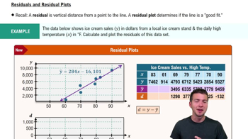
Residuals and Residual Plots