
 05:54
05:54

Textbook Question
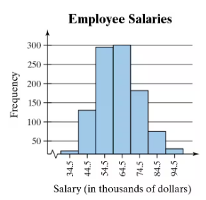
Win 4 Lottery Shown below is a histogram of digits selected in California’s Win 4 lottery. Each drawing involves the random selection (with replacement) of four digits between 0 and 9 inclusive.
c. Identify the frequencies, then test the claim that the digits are selected from a population in which the digits are all equally likely. Is there a problem with the lottery?