
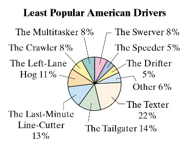
Multiple Choice
A student wants to use the table to create a pie chart demonstrating the cake preferences of their classmates. Find the percent of students who prefer vanilla cake.
 Verified step by step guidanceVerified video answer for a similar problem:
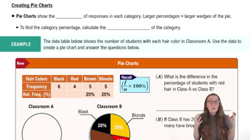
 06:10
06:10 05:54
05:54 4:01
4:01