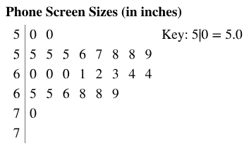
Phone Screen Sizes Display the data below in a dot plot. Describe the differences in how the stem-and-leaf plot and the dot plot show patterns in the data.
Verified step by step guidance
1
Step 1: Understand the stem-and-leaf plot provided. The stem represents the integer part of the phone screen sizes, and the leaf represents the decimal part. For example, '5|0' corresponds to a screen size of 5.0 inches.
Step 2: Extract the data from the stem-and-leaf plot. The screen sizes are: 5.0, 5.0, 5.5, 5.5, 5.6, 5.7, 5.8, 5.8, 5.9, 6.0, 6.0, 6.1, 6.2, 6.3, 6.4, 6.5, 6.5, 6.6, 6.8, 6.8, 6.9, 7.0, and 7.0.
Step 3: Create a dot plot using the extracted data. For each unique screen size, place a dot above the corresponding value on a number line. For example, for 5.0 inches, place two dots above 5.0 since it appears twice in the data.
Step 4: Compare the stem-and-leaf plot and the dot plot. The stem-and-leaf plot organizes the data by grouping screen sizes based on their integer part, making it easier to see clusters and individual values. The dot plot visually represents the frequency of each screen size, making it easier to identify patterns such as the most common sizes.
Step 5: Summarize the differences. The stem-and-leaf plot provides a compact numerical representation, while the dot plot offers a visual frequency distribution. Both are useful for identifying patterns, but the dot plot is more intuitive for visualizing the spread and frequency of the data.
Verified video answer for a similar problem:
This video solution was recommended by our tutors as helpful for the problem above
Video duration:
3m
Play a video:
Was this helpful?
Key Concepts
Here are the essential concepts you must grasp in order to answer the question correctly.
Stem-and-Leaf Plot
A stem-and-leaf plot is a method of displaying quantitative data in a graphical format, similar to a histogram. It separates each data point into a 'stem' (the leading digit or digits) and a 'leaf' (the trailing digit). This format allows for easy visualization of the distribution of data while preserving the original values, making it useful for identifying patterns, such as clusters or gaps in the data.
A dot plot is a simple graphical display that uses dots to represent individual data points along a number line. Each dot corresponds to a value in the dataset, allowing for a quick visual assessment of frequency and distribution. Dot plots are particularly effective for small datasets, as they clearly show the shape of the data distribution and highlight any outliers or clusters.
Data visualization is the graphical representation of information and data. By using visual elements like charts, graphs, and maps, it helps to communicate complex data clearly and efficiently. Effective data visualization allows for easier interpretation of patterns, trends, and outliers, enabling better decision-making based on the insights derived from the data.