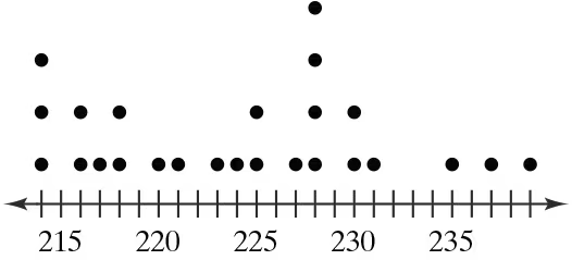
Phone Screen Sizes Display the data below in a dot plot. Describe the differences in how the stem-and-leaf plot and the dot plot show patterns in the data.
Table of contents
- 1. Intro to Stats and Collecting Data55m
- 2. Describing Data with Tables and Graphs1h 55m
- 3. Describing Data Numerically1h 45m
- 4. Probability2h 16m
- 5. Binomial Distribution & Discrete Random Variables2h 33m
- 6. Normal Distribution and Continuous Random Variables1h 38m
- 7. Sampling Distributions & Confidence Intervals: Mean1h 53m
- 8. Sampling Distributions & Confidence Intervals: Proportion1h 12m
- 9. Hypothesis Testing for One Sample2h 19m
- 10. Hypothesis Testing for Two Samples3h 22m
- 11. Correlation1h 6m
- 12. Regression1h 4m
- 13. Chi-Square Tests & Goodness of Fit1h 20m
- 14. ANOVA1h 0m
2. Describing Data with Tables and Graphs
Dot Plots
Problem 2.2.12
Textbook Question
Graphical Analysis In Exercises 9–12, use the stem-and-leaf plot or dot plot to list the actual data entries. What is the maximum data entry? What is the minimum data entry?


1
Observe the dot plot provided. Each dot represents a data entry, and the horizontal axis shows the values of the data. Count the number of dots above each value to determine the frequency of that value.
List all the data entries by recording the value for each dot. For example, if there are three dots above 215, include 215 three times in the data list.
Identify the maximum data entry by finding the largest value on the horizontal axis that has at least one dot above it.
Identify the minimum data entry by finding the smallest value on the horizontal axis that has at least one dot above it.
Summarize the findings by listing the complete data set, the maximum data entry, and the minimum data entry.

This video solution was recommended by our tutors as helpful for the problem above
Video duration:
1mPlay a video:
Was this helpful?
Key Concepts
Here are the essential concepts you must grasp in order to answer the question correctly.
Stem-and-Leaf Plot
A stem-and-leaf plot is a method of displaying quantitative data in a graphical format, similar to a histogram. Each data point is split into a 'stem' (the leading digit or digits) and a 'leaf' (the trailing digit). This allows for easy visualization of the distribution of the data while retaining the original values, making it useful for identifying the shape of the data set.
Recommended video:
Creating Stemplots
Dot Plot
A dot plot is a simple graphical display that uses dots to represent individual data points along a number line. Each dot corresponds to a single observation, making it easy to see the frequency of values and identify clusters or gaps in the data. Dot plots are particularly useful for small data sets and provide a clear visual representation of the distribution.
Recommended video:
Creating Dotplots
Maximum and Minimum Data Entries
The maximum and minimum data entries refer to the highest and lowest values in a data set, respectively. Identifying these values is crucial for understanding the range of the data, which can provide insights into its spread and variability. In graphical representations like dot plots, the maximum is found at the rightmost point, while the minimum is at the leftmost point.
Recommended video:
Guided course
Visualizing Qualitative vs. Quantitative Data
Related Videos
Related Practice
Textbook Question