Back
BackProblem 2.1.7
In Exercises 5–8, identify the class width, class midpoints, and class boundaries for the given frequency distribution. Also identify the number of individuals included in the summary. The frequency distributions are based on real data from Appendix B.
7.
Problem 2.1.32
Exercises 29–34 involve large sets of data, so technology should be used. Complete lists of the data are not listed in Appendix B, but they can be downloaded from the website TriolaStats.com. Use the indicated data and construct the frequency distribution.
Diastolic Blood Pressure Use the diastolic blood pressures of the 300 subjects included in Data Set 1 “Body Data.” Use a class width of 15 mm Hg and begin with a lower class limit of 40 mm Hg. Does the frequency distribution appear to be a normal distribution?
Problem 2.1.22
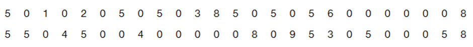
Analysis of Last Digits Weights of respondents were recorded as part of the California Health Interview Survey. The last digits of weights from 50 randomly selected respondents are listed below. Construct a frequency distribution with 10 classes. Based on the distribution, do the weights appear to be reported or actually measured? Does there appear to be a gap in the frequencies and, if so, how might that gap be explained? What do you know about the accuracy of the results?
Problem 2.3.16
In Exercises 15 and 16, construct the frequency polygons.
Presidents Use the frequency distribution from Exercise 14 in Section 2-1 to construct a frequency polygon. Does the graph suggest that the distribution is skewed? If so, how?
Problem 2.2.9
In Exercises 9–18, construct the histograms and answer the given questions.
Chicago Commute Time Use the frequency distribution from Exercise 13 in Section 2-1 to construct a histogram. Does it appear to be the graph of data from a population with a normal distribution?
Problem 2.1.34
Exercises 29–34 involve large sets of data, so technology should be used. Complete lists of the data are not listed in Appendix B, but they can be downloaded from the website TriolaStats.com. Use the indicated data and construct the frequency distribution.
Earthquake Depths Use the depths (km) of the 600 earthquakes included in Data Set 24 “Earthquakes.” Use a class width of 10.0 km and begin with a lower class limit of 0.0 km. Does the frequency distribution appear to be a normal distribution?
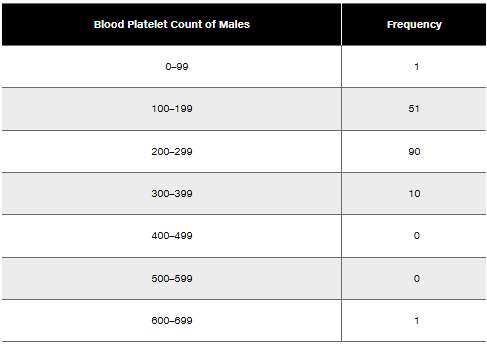
Problem 2.1.8
In Exercises 5–8, identify the class width, class midpoints, and class boundaries for the given frequency distribution. Also identify the number of individuals included in the summary. The frequency distributions are based on real data from Appendix B.
8.
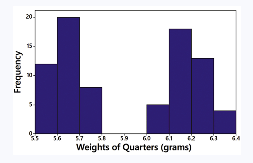
Problem 2.2.7
In Exercises 5–8, answer the questions by referring to the following Minitab-generated histogram, which depicts the weights (grams) of all quarters listed in Data Set 40 “Coin Weights” in Appendix B. (Grams are actually units of mass and the values shown on the horizontal scale are rounded.)
Relative Frequency Histogram How would the shape of the histogram change if the vertical scale uses relative frequencies expressed in percentages instead of the actual frequency counts as shown here?
Problem 2.2.5
In Exercises 5–8, answer the questions by referring to the following Minitab-generated histogram, which depicts the weights (grams) of all quarters listed in Data Set 40 “Coin Weights” in Appendix B. (Grams are actually units of mass and the values shown on the horizontal scale are rounded.)
Sample Size What is the approximate number of quarters depicted in the three bars farthest to the left?
Problem 2.2.1
IQ Scores IQ scores of adults are normally distributed. If a large sample of adults is randomly selected and the IQ scores are illustrated in a histogram, what is the shape of that histogram?
Problem 2.2.17
In Exercises 9–18, construct the histograms and answer the given questions.
Analysis of Last Digits Use the frequency distribution from Exercise 21 in Section 2-1 to construct a histogram. What can be concluded from the distribution of the digits? Specifically, do the heights appear to be reported or actually measured?
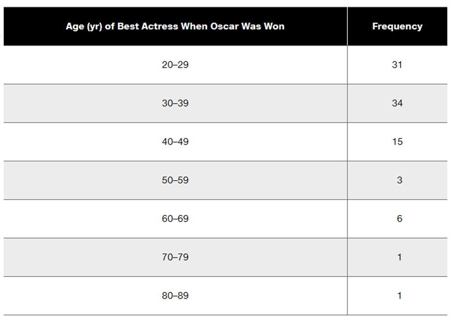
Problem 2.1.25
In Exercises 25 and 26, construct the cumulative frequency distribution that corresponds to the frequency distribution in the exercise indicated.
Exercise 5 (Age of Best Actress When Oscar Was Won)
Problem 2.2.11
In Exercises 9–18, construct the histograms and answer the given questions.
Old Faithful Use the frequency distribution from Exercise 15 in Section 2-1 to construct a histogram. Does it appear to be the graph of data from a population with a normal distribution?
Problem 2.1.17
Burger King Lunch Service Times Refer to Data Set 36 “Fast Food” and use the drive-through service times for Burger King lunches. Begin with a lower class limit of 70 seconds and use a class width of 40 seconds.
[Image]
Problem 2.CQQ.10a
Normal Distribution If the following data are randomly selected, which are expected to have a normal distribution?
a. Weights of Reese’s Peanut Butter Cups
Problem 2.CQQ.10d
Normal Distribution If the following data are randomly selected, which are expected to have a normal distribution?
d. Exact volumes of Coke in 12 oz cans
Problem 2.CQQ.9
Seatbelts The Beams Seatbelts company manufactures—well, you know. When a sample of seatbelts is tested for breaking point (measured in kilograms), the sample data are explored. Identify the important characteristic of data that is missing from this list: center, distribution, outliers, changing characteristics over time.
Problem 2.CQQ.5
Tornado Alley A stemplot of the same data summarized in Exercise 1 is created, and one of the rows of that stemplot is 3 | 000144669. Identify the values represented by that row of the stemplot.
Problem 2.CQQ.6
Computers As a quality control manager at Texas Instruments, you find that defective calculators have various causes, including worn machinery, human error, bad supplies, and packaging mistreatment. Which of the following graphs would be best for describing the causes of defects: histogram; scatterplot; Pareto chart; dotplot; pie chart?
Problem 2.CRE.4a
In Exercises 1–5, use the data listed in the margin, which are magnitudes (Richter scale) and depths (km) of earthquakes from Data Set 24 “Earthquakes” in Appendix B
[Image]
Data Type
a. The listed earthquake depths (km) are all rounded to one decimal place. Before rounding, are the exact depths discrete data or continuous data?
Problem 2.CRE.4b
In Exercises 1–5, use the data listed in the margin, which are magnitudes (Richter scale) and depths (km) of earthquakes from Data Set 24 “Earthquakes” in Appendix B
[Image]
Data Type
b. For the listed earthquake depths, are the data categorical or quantitative?
Problem 2.CRE.4d
In Exercises 1–5, use the data listed in the margin, which are magnitudes (Richter scale) and depths (km) of earthquakes from Data Set 24 “Earthquakes” in Appendix B
[Image]
Data Type
d. Given that the listed earthquake depths are part of a larger collection of depths, do the data constitute a sample or a population?
Problem 2.CRE.4c
In Exercises 1–5, use the data listed in the margin, which are magnitudes (Richter scale) and depths (km) of earthquakes from Data Set 24 “Earthquakes” in Appendix B
[Image]
Data Type
c. Identify the level of measurement of the listed earthquake depths: nominal, ordinal, interval, or ratio.
Problem 2.RE.7
It’s Like Time to Do This Exercise In a Marist survey of adults, these are the words or phrases that subjects find most annoying in conversation (along with their frequencies of response): like (127); just sayin’ (81); you know (104); whatever (219); obviously (35). Construct a pie chart. Identify one disadvantage of a pie chart.
Problem 2.RE.8
Whatever Use the same data from Exercise 7 to construct a Pareto chart. Which graph does a better job of illustrating the data: Pareto chart or pie chart?
Problem 2.RE.6a
Environment
a. After collecting the average (mean) global temperatures for each of the most recent 100 years, we want to construct the graph that is most appropriate for these data. Which graph is best?
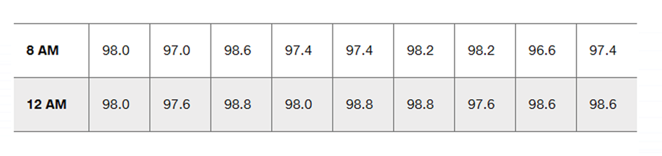
Problem 2.RE.5
Body Temperatures Listed below are the temperatures from nine males measured at 8 AM and again at 12 AM (from Data Set 5 “Body Temperatures” in Appendix B). Construct a scatterplot. Based on the graph, does there appear to be a relationship between 8 AM temperatures and 12 AM temperatures?
Problem 2.4.4a
Estimating r For each of the following, estimate the value of the linear correlation coefficient r for the given paired data obtained from 50 randomly selected adults.
a. Their heights are measured in inches and those same heights are recorded in centimeters .
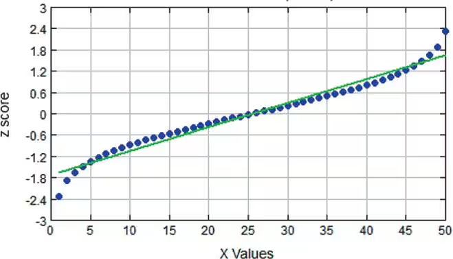
Problem 2.2.19a
Interpreting Normal Quantile Plots Which of the following normal quantile plots appear to represent data from a population having a normal distribution? Explain.
a.
Problem 2.4.4c
Estimating r For each of the following, estimate the value of the linear correlation coefficient r for the given paired data obtained from 50 randomly selected adults.
c. Their pulse rates are measured and their IQ scores are measured .