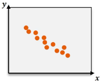
A marketing researcher analyzed advertising budget vs. monthly sales revenue for small retail stores and found that typically the stores that spent more on advertising saw higher sales revenues. However, the relationship wasn't perfect - some stores advertised more but saw fewer sales due to poor location, customer preferences, or bad timing. Which of the following is the most likely value for the correlation coefficient between advertising budget and sales revenue?
Table of contents
- 1. Introduction to Statistics53m
- 2. Describing Data with Tables and Graphs2h 1m
- 3. Describing Data Numerically1h 48m
- 4. Probability2h 26m
- 5. Binomial Distribution & Discrete Random Variables2h 55m
- 6. Normal Distribution & Continuous Random Variables1h 48m
- 7. Sampling Distributions & Confidence Intervals: Mean2h 8m
- 8. Sampling Distributions & Confidence Intervals: Proportion1h 20m
- 9. Hypothesis Testing for One Sample2h 23m
- 10. Hypothesis Testing for Two Samples3h 25m
- 11. Correlation1h 6m
- 12. Regression1h 4m
- 13. Chi-Square Tests & Goodness of Fit1h 30m
- 14. ANOVA1h 4m
11. Correlation
Correlation Coefficient
Struggling with Statistics for Business?
Join thousands of students who trust us to help them ace their exams!Watch the first videoMultiple Choice
A data set is found to have a linear correlation coefficient of r=−0.92. Which of the following graphs most likely represents the relationship between these variables?
A
B
C
D

1
Step 1: Understand the linear correlation coefficient (r). The value of r ranges from -1 to 1, where -1 indicates a perfect negative linear relationship, 0 indicates no linear relationship, and 1 indicates a perfect positive linear relationship. In this case, r = -0.92 indicates a strong negative linear relationship.
Step 2: Analyze the characteristics of a graph with a strong negative linear relationship. In such a graph, as the value of x increases, the value of y decreases consistently, forming a downward-sloping pattern.
Step 3: Examine the provided graphs. The first graph shows no clear pattern, indicating no correlation. The second graph shows a curved pattern, which suggests a non-linear relationship. The third graph shows a scattered pattern with no clear direction, indicating weak or no correlation. The fourth graph shows a clear downward-sloping pattern, consistent with a strong negative linear relationship.
Step 4: Match the graph to the correlation coefficient. Since r = -0.92 represents a strong negative linear relationship, the graph that best matches this description is the fourth graph.
Step 5: Conclude that the fourth graph most likely represents the relationship between the variables, as it visually aligns with the characteristics of a strong negative linear correlation.
Watch next
Master Correlation Coefficient with a bite sized video explanation from Patrick
Start learningRelated Videos
Related Practice