Here are the essential concepts you must grasp in order to answer the question correctly.
Box-and-Whisker Plot
A box-and-whisker plot is a graphical representation of a data set that displays its minimum, first quartile, median, third quartile, and maximum. The 'box' shows the interquartile range (IQR), which contains the middle 50% of the data, while the 'whiskers' extend to the smallest and largest values within 1.5 times the IQR from the quartiles. This visualization helps in comparing distributions and identifying outliers.
Recommended video:
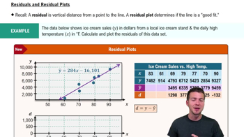
Residuals and Residual Plots
Quartiles
Quartiles are values that divide a data set into four equal parts, each containing 25% of the data. The first quartile (Q1) is the median of the lower half, the second quartile (Q2) is the overall median, and the third quartile (Q3) is the median of the upper half. Understanding quartiles is essential for interpreting box-and-whisker plots, as they provide insights into the spread and central tendency of the data.
Recommended video:
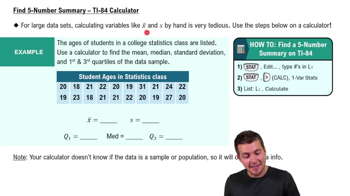
Find 5-Number Summary - TI-84 Calculator
Comparison of Data Sets
Comparing data sets involves analyzing their central tendencies and variability to draw conclusions about their differences. In the context of the box-and-whisker plots for the Punk Rock and Jazz concerts, one can assess which concert had longer song lengths by examining the medians and ranges of the two distributions. This comparison helps in understanding the overall duration and characteristics of the concerts.
Recommended video:
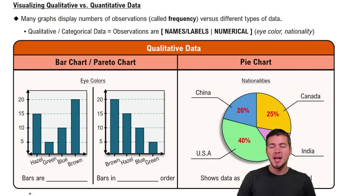
Visualizing Qualitative vs. Quantitative Data