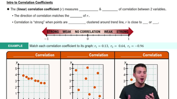
Here are the essential concepts you must grasp in order to answer the question correctly.
Scatterplot
A scatterplot is a graphical representation that displays values for two variables for a set of data. Each point on the plot corresponds to an observation, with one variable plotted along the x-axis and the other along the y-axis. This visualization helps identify potential relationships or correlations between the two variables, such as whether an increase in one variable corresponds to an increase or decrease in the other.
Recommended video:
Scatterplots & Intro to Correlation
Correlation
Correlation refers to a statistical measure that describes the extent to which two variables change together. A positive correlation indicates that as one variable increases, the other also tends to increase, while a negative correlation suggests that as one variable increases, the other tends to decrease. Understanding correlation is crucial for interpreting scatterplots, as it helps determine the strength and direction of the relationship between the variables.
Recommended video:
Descriptive Statistics
Descriptive statistics summarize and describe the main features of a dataset. This includes measures such as mean, median, mode, and standard deviation, which provide insights into the central tendency and variability of the data. In the context of the body temperature measurements, descriptive statistics can help analyze the overall trends and patterns in the temperatures recorded at 8 AM and 12 AM, aiding in the interpretation of the scatterplot.
Recommended video:
Parameters vs. Statistics