Here are the essential concepts you must grasp in order to answer the question correctly.
Mean
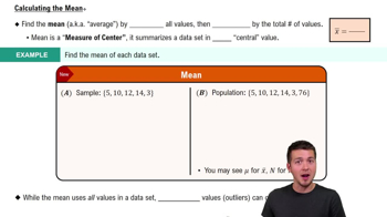
The mean, or average, is a measure of central tendency that summarizes a set of values by dividing the sum of all values by the number of values. In the context of global temperatures, calculating the mean provides a single representative value that reflects the overall trend in temperature changes over the specified period.
Recommended video:
Graph Types
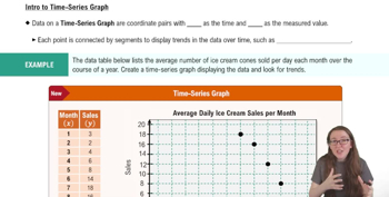
Different types of graphs serve various purposes in data visualization. For time series data, such as average global temperatures over 100 years, line graphs are often the most effective, as they clearly show trends and changes over time, allowing for easy comparison of values across the years.
Recommended video:
Creating Time-Series Graphs
Data Visualization
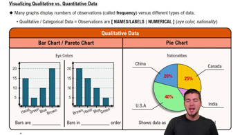
Data visualization is the graphical representation of information and data. It helps in understanding complex data sets by presenting them in a visual context, such as charts or graphs, making it easier to identify patterns, trends, and outliers in the data, which is crucial for interpreting the average global temperatures.
Recommended video:
Visualizing Qualitative vs. Quantitative Data