Here are the essential concepts you must grasp in order to answer the question correctly.
Pie Chart
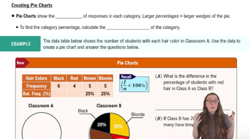
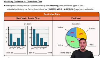
A pie chart is a circular statistical graphic that is divided into slices to illustrate numerical proportions. Each slice represents a category's contribution to the total, making it easy to visualize relative sizes. In the context of the survey, each annoying phrase's frequency can be represented as a slice of the pie, allowing for quick comparisons of how often each phrase is mentioned.
Recommended video:
Data Visualization
Data visualization is the graphical representation of information and data. By using visual elements like charts, graphs, and maps, it helps to make complex data more accessible and understandable. Effective data visualization can reveal patterns, trends, and insights that might not be immediately apparent in raw data, which is crucial when interpreting survey results.
Recommended video:
Visualizing Qualitative vs. Quantitative Data
Disadvantages of Pie Charts
One disadvantage of pie charts is that they can be misleading when comparing similar-sized slices, as small differences in size can be hard to discern visually. Additionally, pie charts do not effectively convey changes over time or the exact values of each category, which can limit their usefulness in certain analytical contexts. This can lead to misinterpretation of the data presented.
Recommended video: