It’s Like Time to Do This Exercise In a Marist survey of adults, these are the words or phrases that subjects find most annoying in conversation (along with their frequencies of response): like (127); just sayin’ (81); you know (104); whatever (219); obviously (35). Construct a pie chart. Identify one disadvantage of a pie chart.
Table of contents
- 1. Intro to Stats and Collecting Data1h 14m
- 2. Describing Data with Tables and Graphs1h 56m
- 3. Describing Data Numerically2h 5m
- 4. Probability2h 16m
- 5. Binomial Distribution & Discrete Random Variables3h 6m
- 6. Normal Distribution and Continuous Random Variables2h 11m
- 7. Sampling Distributions & Confidence Intervals: Mean3h 23m
- Sampling Distribution of the Sample Mean and Central Limit Theorem19m
- Distribution of Sample Mean - Excel23m
- Introduction to Confidence Intervals15m
- Confidence Intervals for Population Mean1h 18m
- Determining the Minimum Sample Size Required12m
- Finding Probabilities and T Critical Values - Excel28m
- Confidence Intervals for Population Means - Excel25m
- 8. Sampling Distributions & Confidence Intervals: Proportion2h 10m
- 9. Hypothesis Testing for One Sample5h 8m
- Steps in Hypothesis Testing1h 6m
- Performing Hypothesis Tests: Means1h 4m
- Hypothesis Testing: Means - Excel42m
- Performing Hypothesis Tests: Proportions37m
- Hypothesis Testing: Proportions - Excel27m
- Performing Hypothesis Tests: Variance12m
- Critical Values and Rejection Regions28m
- Link Between Confidence Intervals and Hypothesis Testing12m
- Type I & Type II Errors16m
- 10. Hypothesis Testing for Two Samples5h 37m
- Two Proportions1h 13m
- Two Proportions Hypothesis Test - Excel28m
- Two Means - Unknown, Unequal Variance1h 3m
- Two Means - Unknown Variances Hypothesis Test - Excel12m
- Two Means - Unknown, Equal Variance15m
- Two Means - Unknown, Equal Variances Hypothesis Test - Excel9m
- Two Means - Known Variance12m
- Two Means - Sigma Known Hypothesis Test - Excel21m
- Two Means - Matched Pairs (Dependent Samples)42m
- Matched Pairs Hypothesis Test - Excel12m
- Two Variances and F Distribution29m
- Two Variances - Graphing Calculator16m
- 11. Correlation1h 24m
- 12. Regression3h 33m
- Linear Regression & Least Squares Method26m
- Residuals12m
- Coefficient of Determination12m
- Regression Line Equation and Coefficient of Determination - Excel8m
- Finding Residuals and Creating Residual Plots - Excel11m
- Inferences for Slope31m
- Enabling Data Analysis Toolpak1m
- Regression Readout of the Data Analysis Toolpak - Excel21m
- Prediction Intervals13m
- Prediction Intervals - Excel19m
- Multiple Regression - Excel29m
- Quadratic Regression15m
- Quadratic Regression - Excel10m
- 13. Chi-Square Tests & Goodness of Fit2h 21m
- 14. ANOVA2h 28m
2. Describing Data with Tables and Graphs
Visualizing Qualitative vs. Quantitative Data
Problem 4.CRE.5
Textbook Question
Heights of Presidents Theories have been developed about the heights of winning candidates for the U.S. presidency and the heights of candidates who were runners up. Listed below are heights (cm) from recent presidential elections. Construct a graph suitable for exploring an association between heights of presidents and the heights of the presidential candidates who were runners-up. What does the graph suggest about that association?

 Verified step by step guidance
1
Step 1: Identify the type of graph suitable for exploring the association between the heights of winners and runners-up. A scatter plot is ideal for visualizing the relationship between two numerical variables, such as the heights of winners and runners-up.
Step 2: Label the axes of the scatter plot. The x-axis can represent the heights of the winners (in cm), and the y-axis can represent the heights of the runners-up (in cm). This ensures clarity in interpreting the graph.
Step 3: Plot the data points on the scatter plot. For each pair of heights (winner and runner-up), plot a point where the x-coordinate corresponds to the winner's height and the y-coordinate corresponds to the runner-up's height. For example, the first pair (182, 180) would be plotted as (182, 180).
Step 4: Analyze the pattern of the points on the scatter plot. Look for trends, such as whether the points tend to cluster along a diagonal line, which would suggest a positive association between the heights of winners and runners-up.
Step 5: Interpret the graph. If the points show a clear trend (e.g., taller winners tend to have taller runners-up), this suggests a positive association. If the points are scattered without a clear pattern, it suggests no strong association between the heights of winners and runners-up.
 Verified video answer for a similar problem:
This video solution was recommended by our tutors as helpful for the problem above
Video duration:
3mPlay a video:
0 Comments
Key Concepts
Here are the essential concepts you must grasp in order to answer the question correctly.
Scatter Plot
A scatter plot is a graphical representation used to display the relationship between two quantitative variables. In this context, it can be used to plot the heights of winning presidential candidates against the heights of their runners-up. Each point on the graph represents a pair of heights, allowing for visual assessment of any correlation or trend between the two sets of data.
Recommended video:

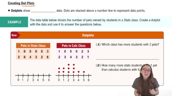
Creating Dotplots
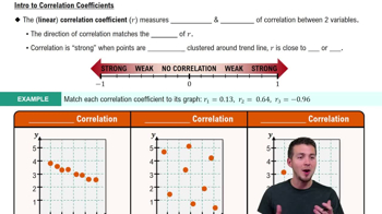
Correlation
Correlation measures the strength and direction of a linear relationship between two variables. In this case, it helps to determine whether taller winning candidates tend to have taller or shorter runners-up. A positive correlation would suggest that as the height of winners increases, so does the height of runners-up, while a negative correlation would indicate the opposite.
Recommended video:
Guided course

Correlation Coefficient
Descriptive Statistics
Descriptive statistics summarize and describe the main features of a dataset. For the heights of presidents and their runners-up, measures such as mean, median, and range can provide insights into the overall height trends. Understanding these statistics is essential for interpreting the data accurately and making informed conclusions about the association between the two groups.
Recommended video:
Guided course

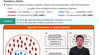
Parameters vs. Statistics
Related Videos
Related Practice
Textbook Question


