Here are the essential concepts you must grasp in order to answer the question correctly.
Probability
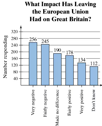
Probability is a measure of the likelihood that a particular event will occur, expressed as a number between 0 and 1. In this context, it involves calculating the proportion of respondents who feel a certain way about Brexit's impact, relative to the total number of surveyed individuals. For example, if 134 out of 1115 respondents feel that the impact was 'very positive,' the probability of randomly selecting someone with that opinion can be calculated as 134/1115.
Recommended video:
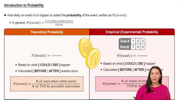
Introduction to Probability
Pareto Chart
A Pareto chart is a type of bar graph that represents the frequency of different categories in descending order. It is used to highlight the most significant factors in a dataset. In this case, the chart displays the responses of British adults regarding the impact of Brexit, allowing for a quick visual assessment of which opinions are most prevalent, such as 'very negative' and 'fairly negative' being the highest.
Recommended video:
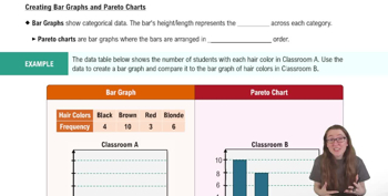
Creating Bar Graphs and Pareto Charts
Categorical Data
Categorical data refers to data that can be divided into distinct categories, which can be nominal or ordinal. In this survey, responses about Brexit's impact are categorical, as they represent different opinions (e.g., 'very negative,' 'fairly positive'). Understanding categorical data is essential for analyzing survey results, as it informs how to interpret and visualize the data effectively.
Recommended video:
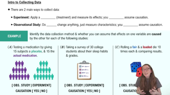
Introduction to Collecting Data