Whatever Use the same data from Exercise 7 to construct a Pareto chart. Which graph does a better job of illustrating the data: Pareto chart or pie chart?
Table of contents
- 1. Intro to Stats and Collecting Data1h 14m
- 2. Describing Data with Tables and Graphs1h 56m
- 3. Describing Data Numerically2h 5m
- 4. Probability2h 16m
- 5. Binomial Distribution & Discrete Random Variables3h 6m
- 6. Normal Distribution and Continuous Random Variables2h 11m
- 7. Sampling Distributions & Confidence Intervals: Mean3h 23m
- Sampling Distribution of the Sample Mean and Central Limit Theorem19m
- Distribution of Sample Mean - Excel23m
- Introduction to Confidence Intervals15m
- Confidence Intervals for Population Mean1h 18m
- Determining the Minimum Sample Size Required12m
- Finding Probabilities and T Critical Values - Excel28m
- Confidence Intervals for Population Means - Excel25m
- 8. Sampling Distributions & Confidence Intervals: Proportion2h 10m
- 9. Hypothesis Testing for One Sample5h 8m
- Steps in Hypothesis Testing1h 6m
- Performing Hypothesis Tests: Means1h 4m
- Hypothesis Testing: Means - Excel42m
- Performing Hypothesis Tests: Proportions37m
- Hypothesis Testing: Proportions - Excel27m
- Performing Hypothesis Tests: Variance12m
- Critical Values and Rejection Regions28m
- Link Between Confidence Intervals and Hypothesis Testing12m
- Type I & Type II Errors16m
- 10. Hypothesis Testing for Two Samples5h 37m
- Two Proportions1h 13m
- Two Proportions Hypothesis Test - Excel28m
- Two Means - Unknown, Unequal Variance1h 3m
- Two Means - Unknown Variances Hypothesis Test - Excel12m
- Two Means - Unknown, Equal Variance15m
- Two Means - Unknown, Equal Variances Hypothesis Test - Excel9m
- Two Means - Known Variance12m
- Two Means - Sigma Known Hypothesis Test - Excel21m
- Two Means - Matched Pairs (Dependent Samples)42m
- Matched Pairs Hypothesis Test - Excel12m
- Two Variances and F Distribution29m
- Two Variances - Graphing Calculator16m
- 11. Correlation1h 24m
- 12. Regression3h 33m
- Linear Regression & Least Squares Method26m
- Residuals12m
- Coefficient of Determination12m
- Regression Line Equation and Coefficient of Determination - Excel8m
- Finding Residuals and Creating Residual Plots - Excel11m
- Inferences for Slope31m
- Enabling Data Analysis Toolpak1m
- Regression Readout of the Data Analysis Toolpak - Excel21m
- Prediction Intervals13m
- Prediction Intervals - Excel19m
- Multiple Regression - Excel29m
- Quadratic Regression15m
- Quadratic Regression - Excel10m
- 13. Chi-Square Tests & Goodness of Fit2h 21m
- 14. ANOVA2h 28m
2. Describing Data with Tables and Graphs
Visualizing Qualitative vs. Quantitative Data
Problem 12.CRE.8
Textbook Question
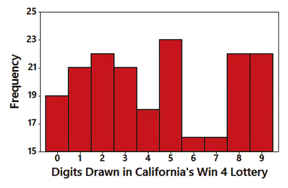
Win 4 Lottery Shown below is a histogram of digits selected in California’s Win 4 lottery. Each drawing involves the random selection (with replacement) of four digits between 0 and 9 inclusive.
b. Does the display depict a normal distribution? Why or why not? What should be the shape of the histogram?

 Verified step by step guidance
1
Observe the histogram provided. A normal distribution is characterized by a symmetric, bell-shaped curve where most of the data is concentrated around the mean, and the frequencies taper off equally on both sides.
Analyze the shape of the histogram. In this case, the frequencies of the digits are not symmetric. For example, digits like 6 and 7 have very low frequencies compared to others, and there are peaks at digits like 2, 5, 8, and 9.
Conclude that the histogram does not depict a normal distribution because it lacks symmetry and the bell-shaped curve. Instead, the distribution appears irregular with multiple peaks and valleys.
Consider what the shape of the histogram should be. Since the lottery involves random selection with replacement, each digit (0 through 9) should theoretically have an equal probability of being selected. This would result in a uniform distribution where all bars in the histogram are approximately the same height.
Summarize that the observed histogram deviates from the expected uniform distribution, suggesting potential irregularities or biases in the digit selection process.
 Verified video answer for a similar problem:
This video solution was recommended by our tutors as helpful for the problem above
Video duration:
2mPlay a video:
0 Comments
Key Concepts
Here are the essential concepts you must grasp in order to answer the question correctly.
Normal Distribution
A normal distribution is a symmetric, bell-shaped distribution characterized by its mean and standard deviation. In a normal distribution, most of the data points cluster around the mean, with fewer points appearing as you move away from the mean. This distribution is important in statistics because many statistical tests assume normality in the data.
Recommended video:
Guided course

Finding Standard Normal Probabilities using z-Table
Histogram
A histogram is a graphical representation of the distribution of numerical data, where the data is divided into bins or intervals. The height of each bar indicates the frequency of data points within that interval. Histograms are useful for visualizing the shape of the data distribution, including its central tendency and variability.
Recommended video:
Guided course

Intro to Histograms
Random Sampling
Random sampling is a technique used to select a subset of individuals from a larger population, where each individual has an equal chance of being chosen. In the context of the lottery, random sampling ensures that each digit has an equal probability of being drawn, which is essential for the fairness and unpredictability of the lottery results.
Recommended video:

Sampling Distribution of Sample Proportion

 4:39m
4:39mWatch next
Master Visualizing Qualitative vs. Quantitative Data with a bite sized video explanation from Patrick
Start learningRelated Videos
Related Practice
Textbook Question
