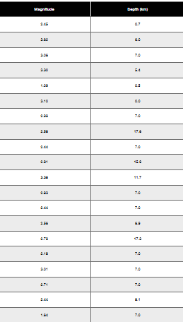
Here are the essential concepts you must grasp in order to answer the question correctly.
Histogram
A histogram is a graphical representation of the distribution of numerical data, where the data is divided into intervals (bins) and the frequency of data points within each interval is represented by the height of bars. In this context, the histogram will display the frequency distribution of earthquake magnitudes, allowing for visual analysis of how often different magnitude ranges occur.
Recommended video:
Class Midpoint
The class midpoint is the value that lies in the middle of a class interval in a frequency distribution. It is calculated by averaging the upper and lower boundaries of the class. In constructing the histogram for the earthquake data, using class midpoints on the horizontal axis helps to accurately represent the central tendency of the data within each interval.
Recommended video:
Frequency Polygons Example 1
Distribution Shape
The shape of a distribution describes how data points are spread across different values. Common shapes include uniform, normal, skewed left, and skewed right. Understanding the distribution shape is crucial for interpreting the histogram, as it provides insights into the underlying patterns of the data, such as whether most earthquakes are of low or high magnitude.
Recommended video:
Sampling Distribution of Sample Proportion