Cell Phone Radiation If we collect a sample of cell phone radiation amounts much larger than the sample included with Exercise 3, and if our sample includes a single outlier, how will that outlier appear in a histogram?
Table of contents
- 1. Intro to Stats and Collecting Data1h 14m
- 2. Describing Data with Tables and Graphs1h 56m
- 3. Describing Data Numerically2h 5m
- 4. Probability2h 16m
- 5. Binomial Distribution & Discrete Random Variables3h 6m
- 6. Normal Distribution and Continuous Random Variables2h 11m
- 7. Sampling Distributions & Confidence Intervals: Mean3h 23m
- Sampling Distribution of the Sample Mean and Central Limit Theorem19m
- Distribution of Sample Mean - Excel23m
- Introduction to Confidence Intervals15m
- Confidence Intervals for Population Mean1h 18m
- Determining the Minimum Sample Size Required12m
- Finding Probabilities and T Critical Values - Excel28m
- Confidence Intervals for Population Means - Excel25m
- 8. Sampling Distributions & Confidence Intervals: Proportion2h 10m
- 9. Hypothesis Testing for One Sample5h 8m
- Steps in Hypothesis Testing1h 6m
- Performing Hypothesis Tests: Means1h 4m
- Hypothesis Testing: Means - Excel42m
- Performing Hypothesis Tests: Proportions37m
- Hypothesis Testing: Proportions - Excel27m
- Performing Hypothesis Tests: Variance12m
- Critical Values and Rejection Regions28m
- Link Between Confidence Intervals and Hypothesis Testing12m
- Type I & Type II Errors16m
- 10. Hypothesis Testing for Two Samples5h 37m
- Two Proportions1h 13m
- Two Proportions Hypothesis Test - Excel28m
- Two Means - Unknown, Unequal Variance1h 3m
- Two Means - Unknown Variances Hypothesis Test - Excel12m
- Two Means - Unknown, Equal Variance15m
- Two Means - Unknown, Equal Variances Hypothesis Test - Excel9m
- Two Means - Known Variance12m
- Two Means - Sigma Known Hypothesis Test - Excel21m
- Two Means - Matched Pairs (Dependent Samples)42m
- Matched Pairs Hypothesis Test - Excel12m
- Two Variances and F Distribution29m
- Two Variances - Graphing Calculator16m
- 11. Correlation1h 24m
- 12. Regression3h 33m
- Linear Regression & Least Squares Method26m
- Residuals12m
- Coefficient of Determination12m
- Regression Line Equation and Coefficient of Determination - Excel8m
- Finding Residuals and Creating Residual Plots - Excel11m
- Inferences for Slope31m
- Enabling Data Analysis Toolpak1m
- Regression Readout of the Data Analysis Toolpak - Excel21m
- Prediction Intervals13m
- Prediction Intervals - Excel19m
- Multiple Regression - Excel29m
- Quadratic Regression15m
- Quadratic Regression - Excel10m
- 13. Chi-Square Tests & Goodness of Fit2h 21m
- 14. ANOVA2h 28m
2. Describing Data with Tables and Graphs
Histograms
Problem 10.5.4
Textbook Question
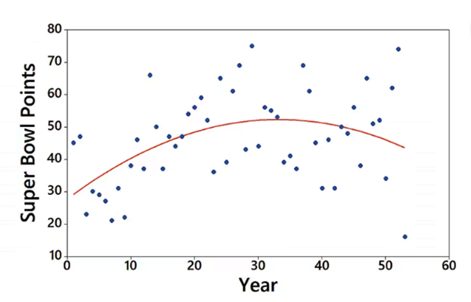
Interpreting a Graph The accompanying graph plots the numbers of points scored in each Super Bowl from the first Super Bowl in 1967 (coded as year 1) to the last Super Bowl at the time of this writing. The graph of the quadratic equation that best fits the data is also shown in red. What feature of the graph justifies the value of R^2 = 0.205 for the quadratic model?

 Verified step by step guidance
1
Step 1: Understand the value of R^2. The R^2 value, also known as the coefficient of determination, measures how well the quadratic model (red curve) explains the variability in the data points (blue dots). A value of R^2 = 0.205 indicates that only 20.5% of the variability in the data is explained by the quadratic model.
Step 2: Observe the graph. The blue dots represent the actual points scored in each Super Bowl, while the red curve represents the quadratic model that best fits the data. Notice that the data points are widely scattered around the red curve, indicating a weak fit.
Step 3: Analyze the scatter of data points. The large spread of the blue dots around the red curve suggests that the quadratic model does not closely follow the actual data. This lack of closeness justifies the relatively low R^2 value.
Step 4: Consider alternative models. The low R^2 value implies that the quadratic model may not be the best choice for explaining the data. A different model, such as a linear or higher-order polynomial, might provide a better fit.
Step 5: Relate the graph to the R^2 value. The feature of the graph that justifies the R^2 value is the significant deviation of the blue dots from the red curve, which shows that the quadratic model captures only a small portion of the variability in the data.
 Verified video answer for a similar problem:
This video solution was recommended by our tutors as helpful for the problem above
Video duration:
2mPlay a video:
0 Comments
Key Concepts
Here are the essential concepts you must grasp in order to answer the question correctly.
R-squared (R²)
R-squared, or R², is a statistical measure that represents the proportion of variance for a dependent variable that's explained by an independent variable or variables in a regression model. An R² value of 0.205 indicates that only 20.5% of the variability in Super Bowl points can be explained by the quadratic model, suggesting a weak fit. This low value implies that other factors may significantly influence the points scored, which are not captured by the model.
Recommended video:
Guided course

Intro to Least Squares Regression
Quadratic Regression
Quadratic regression is a type of polynomial regression that models the relationship between a dependent variable and an independent variable using a quadratic equation (a second-degree polynomial). In the context of the Super Bowl points graph, the quadratic model attempts to capture the trend of points scored over the years, represented by the red curve. This model is useful for identifying non-linear relationships, but its effectiveness is indicated by the R² value.
Recommended video:
Guided course

Intro to Least Squares Regression
Data Dispersion
Data dispersion refers to the spread of data points around a central value, often visualized in a scatter plot. In the provided graph, the blue points show considerable scatter around the red quadratic trend line, indicating variability in Super Bowl scores that the model does not account for. High dispersion can lead to a lower R² value, as it suggests that the model does not fit the data well, highlighting the complexity of predicting scores based solely on year.
Recommended video:

Introduction to Collecting Data
Related Videos
Related Practice
Textbook Question


