The following data set shows the number of overtime hours that 12 employees worked in a month. Construct a frequency distribution, suing a lower class limit of 3 and a class width of 4.
Table of contents
- 1. Intro to Stats and Collecting Data1h 14m
- 2. Describing Data with Tables and Graphs1h 56m
- 3. Describing Data Numerically2h 5m
- 4. Probability2h 16m
- 5. Binomial Distribution & Discrete Random Variables3h 6m
- 6. Normal Distribution and Continuous Random Variables2h 11m
- 7. Sampling Distributions & Confidence Intervals: Mean3h 23m
- Sampling Distribution of the Sample Mean and Central Limit Theorem19m
- Distribution of Sample Mean - Excel23m
- Introduction to Confidence Intervals15m
- Confidence Intervals for Population Mean1h 18m
- Determining the Minimum Sample Size Required12m
- Finding Probabilities and T Critical Values - Excel28m
- Confidence Intervals for Population Means - Excel25m
- 8. Sampling Distributions & Confidence Intervals: Proportion2h 10m
- 9. Hypothesis Testing for One Sample5h 8m
- Steps in Hypothesis Testing1h 6m
- Performing Hypothesis Tests: Means1h 4m
- Hypothesis Testing: Means - Excel42m
- Performing Hypothesis Tests: Proportions37m
- Hypothesis Testing: Proportions - Excel27m
- Performing Hypothesis Tests: Variance12m
- Critical Values and Rejection Regions28m
- Link Between Confidence Intervals and Hypothesis Testing12m
- Type I & Type II Errors16m
- 10. Hypothesis Testing for Two Samples5h 37m
- Two Proportions1h 13m
- Two Proportions Hypothesis Test - Excel28m
- Two Means - Unknown, Unequal Variance1h 3m
- Two Means - Unknown Variances Hypothesis Test - Excel12m
- Two Means - Unknown, Equal Variance15m
- Two Means - Unknown, Equal Variances Hypothesis Test - Excel9m
- Two Means - Known Variance12m
- Two Means - Sigma Known Hypothesis Test - Excel21m
- Two Means - Matched Pairs (Dependent Samples)42m
- Matched Pairs Hypothesis Test - Excel12m
- Two Variances and F Distribution29m
- Two Variances - Graphing Calculator16m
- 11. Correlation1h 24m
- 12. Regression3h 33m
- Linear Regression & Least Squares Method26m
- Residuals12m
- Coefficient of Determination12m
- Regression Line Equation and Coefficient of Determination - Excel8m
- Finding Residuals and Creating Residual Plots - Excel11m
- Inferences for Slope31m
- Enabling Data Analysis Toolpak1m
- Regression Readout of the Data Analysis Toolpak - Excel21m
- Prediction Intervals13m
- Prediction Intervals - Excel19m
- Multiple Regression - Excel29m
- Quadratic Regression15m
- Quadratic Regression - Excel10m
- 13. Chi-Square Tests & Goodness of Fit2h 21m
- 14. ANOVA2h 28m
2. Describing Data with Tables and Graphs
Visualizing Qualitative vs. Quantitative Data
Problem 6.CRE.2d
Textbook Question
In Exercises 1 and 2, use the following wait times (minutes) at 10:00 AM for the Tower of Terror ride at Disney World (from Data Set 33 “Disney World Wait Times” in Appendix B).
35 35 20 50 95 75 45 50 30 35 30 30
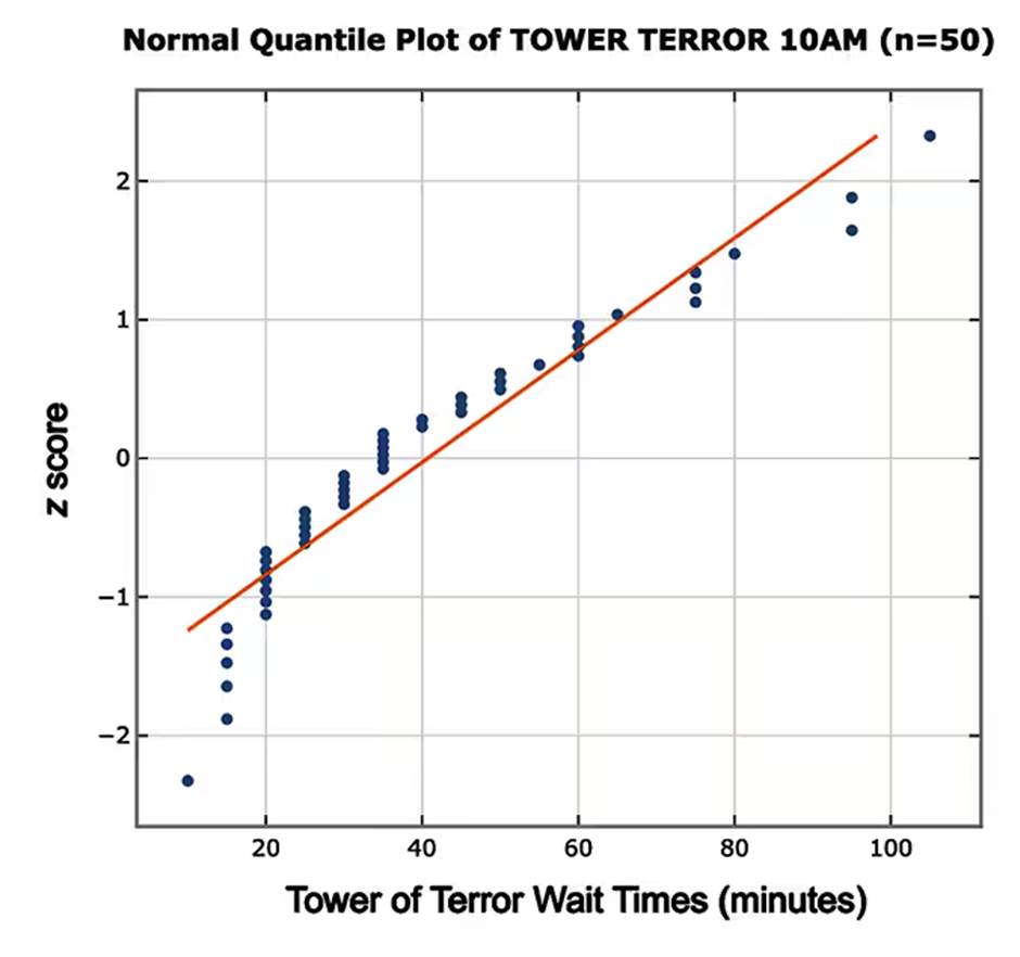
d. The accompanying normal quantile plot is obtained by using all 50 wait times at 10:00 AM for the Tower of Terror ride at Disney World. Based on this normal quantile plot, do the sample data appear to be from a normally distributed population?

 Verified step by step guidance
1
Step 1: Understand the purpose of a normal quantile plot. A normal quantile plot is used to assess whether a dataset follows a normal distribution. If the points in the plot closely follow a straight line, the data is likely from a normally distributed population.
Step 2: Examine the provided normal quantile plot. The plot shows the wait times (minutes) for the Tower of Terror ride at 10:00 AM, with Z-scores on the vertical axis and wait times on the horizontal axis. The orange line represents the expected linear relationship if the data were perfectly normal.
Step 3: Analyze the alignment of the data points with the orange line. In the plot, most of the data points closely follow the orange line, indicating a strong linear relationship. However, there are slight deviations at the extremes (lower and upper ends of the wait times).
Step 4: Interpret the deviations. The slight deviations at the extremes suggest that the data may not be perfectly normal, but the overall alignment with the line indicates that the data is approximately normal.
Step 5: Conclude based on the analysis. Based on the normal quantile plot, the sample data appears to be from a population that is approximately normally distributed, with minor deviations at the extremes.
 Verified video answer for a similar problem:
This video solution was recommended by our tutors as helpful for the problem above
Video duration:
2mPlay a video:
0 Comments
Key Concepts
Here are the essential concepts you must grasp in order to answer the question correctly.
Normal Distribution
A normal distribution is a probability distribution that is symmetric about the mean, showing that data near the mean are more frequent in occurrence than data far from the mean. It is characterized by its bell-shaped curve, defined by its mean and standard deviation. Understanding this concept is crucial for determining if a dataset follows a normal distribution, which is often a prerequisite for various statistical analyses.
Recommended video:
Guided course

Finding Z-Scores for Non-Standard Normal Variables
Quantile Plot
A quantile plot, specifically a normal quantile plot, is a graphical tool used to assess if a dataset follows a normal distribution. It plots the quantiles of the data against the quantiles of a normal distribution. If the points in the plot closely follow a straight line, it suggests that the data are normally distributed. Deviations from this line indicate departures from normality.
Recommended video:
Guided course

Residuals and Residual Plots
Z-Score
A z-score is a statistical measurement that describes a value's relationship to the mean of a group of values. It is calculated by subtracting the mean from the value and then dividing by the standard deviation. Z-scores are essential in normal quantile plots as they standardize the data, allowing for comparison across different datasets and helping to identify how far a data point is from the mean in terms of standard deviations.
Recommended video:
Guided course

Z-Scores From Given Probability - TI-84 (CE) Calculator
Related Videos
Related Practice
Multiple Choice


