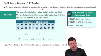
Ethics There are data showing that smoking is detrimental to good health. Given that people could be helped and lives could be saved by reducing smoking, is it ethical to graph the data in a way that is misleading by exaggerating the health risks of smoking?
Table of contents
- 1. Intro to Stats and Collecting Data1h 14m
- 2. Describing Data with Tables and Graphs1h 55m
- 3. Describing Data Numerically2h 5m
- 4. Probability2h 16m
- 5. Binomial Distribution & Discrete Random Variables3h 6m
- 6. Normal Distribution and Continuous Random Variables2h 11m
- 7. Sampling Distributions & Confidence Intervals: Mean3h 23m
- Sampling Distribution of the Sample Mean and Central Limit Theorem19m
- Distribution of Sample Mean - Excel23m
- Introduction to Confidence Intervals15m
- Confidence Intervals for Population Mean1h 18m
- Determining the Minimum Sample Size Required12m
- Finding Probabilities and T Critical Values - Excel28m
- Confidence Intervals for Population Means - Excel25m
- 8. Sampling Distributions & Confidence Intervals: Proportion1h 12m
- 9. Hypothesis Testing for One Sample3h 29m
- 10. Hypothesis Testing for Two Samples4h 50m
- Two Proportions1h 13m
- Two Proportions Hypothesis Test - Excel28m
- Two Means - Unknown, Unequal Variance1h 3m
- Two Means - Unknown Variances Hypothesis Test - Excel12m
- Two Means - Unknown, Equal Variance15m
- Two Means - Unknown, Equal Variances Hypothesis Test - Excel9m
- Two Means - Known Variance12m
- Two Means - Sigma Known Hypothesis Test - Excel21m
- Two Means - Matched Pairs (Dependent Samples)42m
- Matched Pairs Hypothesis Test - Excel12m
- 11. Correlation1h 6m
- 12. Regression1h 50m
- 13. Chi-Square Tests & Goodness of Fit1h 57m
- 14. ANOVA1h 57m
2. Describing Data with Tables and Graphs
Visualizing Qualitative vs. Quantitative Data
Problem 6.CRE.2b
Textbook Question
In Exercises 1 and 2, use the following wait times (minutes) at 10:00 AM for the Tower of Terror ride at Disney World (from Data Set 33 “Disney World Wait Times” in Appendix B).
35 35 20 50 95 75 45 50 30 35 30 30
b. Construct a boxplot.
Verified step by step guidance1
Step 1: Organize the data in ascending order. The given wait times are: 35, 35, 20, 50, 95, 75, 45, 50, 30, 35, 30, 30. Arrange them in increasing order: 20, 30, 30, 30, 35, 35, 35, 45, 50, 50, 75, 95.
Step 2: Identify the five-number summary for the data. These include the minimum value, first quartile (Q1), median (Q2), third quartile (Q3), and maximum value. Use the ordered data to calculate these values.
Step 3: Calculate Q1 (first quartile) and Q3 (third quartile). Q1 is the median of the lower half of the data (excluding the overall median), and Q3 is the median of the upper half of the data (excluding the overall median).
Step 4: Determine the interquartile range (IQR) using the formula: . Use the IQR to identify any potential outliers, which are values below or above .
Step 5: Construct the boxplot. Draw a box from Q1 to Q3 with a line at the median (Q2). Extend whiskers from the box to the minimum and maximum values that are not outliers. Mark any outliers separately as individual points.
Verified video answer for a similar problem:This video solution was recommended by our tutors as helpful for the problem above
Video duration:
6mPlay a video:
Was this helpful?
Key Concepts
Here are the essential concepts you must grasp in order to answer the question correctly.
Boxplot
A boxplot, or box-and-whisker plot, is a graphical representation of a dataset that displays its central tendency and variability. It shows the median, quartiles, and potential outliers, providing a visual summary of the distribution. The box represents the interquartile range (IQR), which contains the middle 50% of the data, while the 'whiskers' extend to the smallest and largest values within 1.5 times the IQR from the quartiles.
Quartiles
Quartiles are values that divide a dataset into four equal parts, helping to understand its distribution. The first quartile (Q1) is the median of the lower half of the data, the second quartile (Q2) is the overall median, and the third quartile (Q3) is the median of the upper half. These values are essential for constructing a boxplot, as they determine the box's edges and the whiskers' extent.
Recommended video:
Guided course
Find 5-Number Summary - TI-84 Calculator
Outliers
Outliers are data points that significantly differ from other observations in a dataset. They can skew the results and affect statistical analyses. In the context of a boxplot, outliers are typically identified as points that lie beyond 1.5 times the IQR from the quartiles, and they are often represented as individual dots outside the whiskers, indicating their potential impact on the overall data interpretation.
Recommended video:
Guided course
Comparing Mean vs. Median
Watch next
Master Visualizing Qualitative vs. Quantitative Data with a bite sized video explanation from Patrick
Start learningRelated Videos
Related Practice
Textbook Question
