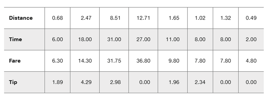
Exact Method For each of the three different methods of hypothesis testing (identified in the left column), enter the P-values corresponding to the given alternative hypothesis and sample data. Use a 0.05 significance level. Note that the entries in the last column correspond to the Chapter Problem. How do the results agree with the large sample size?
Table of contents
- 1. Intro to Stats and Collecting Data55m
- 2. Describing Data with Tables and Graphs1h 55m
- 3. Describing Data Numerically1h 45m
- 4. Probability2h 16m
- 5. Binomial Distribution & Discrete Random Variables2h 33m
- 6. Normal Distribution and Continuous Random Variables1h 38m
- 7. Sampling Distributions & Confidence Intervals: Mean1h 53m
- 8. Sampling Distributions & Confidence Intervals: Proportion1h 12m
- 9. Hypothesis Testing for One Sample2h 19m
- 10. Hypothesis Testing for Two Samples3h 22m
- 11. Correlation1h 6m
- 12. Regression1h 4m
- 13. Chi-Square Tests & Goodness of Fit1h 20m
- 14. ANOVA1h 0m
9. Hypothesis Testing for One Sample
Steps in Hypothesis Testing
Problem 10.1.15
Textbook Question
Testing for a Linear Correlation
In Exercises 13–28, construct a scatterplot, and find the value of the linear correlation coefficient r. Also find the P-value or the critical values of r from Table A-6. Use a significance level of α = 0.05. Determine whether there is sufficient evidence to support a claim of a linear correlation between the two variables. (Save your work because the same data sets will be used in Section 10-2 exercises.)
Taxis The table below includes data from New York City taxi rides (from Data Set 32 “Taxis” in Appendix B). The distances are in miles, the times are in minutes, the fares are in dollars, and the tips are in dollars. Is there sufficient evidence to support the claim that there is a linear correlation between the time of the ride and the tip amount? Does it appear that riders base their tips on the time of the ride?


1
Step 1: Construct a scatterplot using the given data. Plot 'Time' (in minutes) on the x-axis and 'Tip' (in dollars) on the y-axis. Each pair of values from the table represents a point on the scatterplot.
Step 2: Calculate the linear correlation coefficient (r) using the formula: r = (nΣxy - ΣxΣy) / sqrt((nΣx² - (Σx)²)(nΣy² - (Σy)²)), where x represents 'Time' and y represents 'Tip'. Substitute the values from the table into the formula.
Step 3: Determine the P-value or critical values of r using Table A-6 for a significance level of α = 0.05. The degrees of freedom (df) for this test are calculated as df = n - 2, where n is the number of data points.
Step 4: Compare the calculated r value and the P-value (or critical values) to the significance level α = 0.05. If the P-value is less than α or if r exceeds the critical value, there is sufficient evidence to support the claim of a linear correlation.
Step 5: Interpret the results. If there is sufficient evidence of a linear correlation, discuss whether the scatterplot and correlation coefficient suggest that riders base their tips on the time of the ride. If not, explain why the evidence does not support the claim.

This video solution was recommended by our tutors as helpful for the problem above
Video duration:
3mPlay a video:
Was this helpful?
Key Concepts
Here are the essential concepts you must grasp in order to answer the question correctly.
Linear Correlation Coefficient (r)
The linear correlation coefficient, denoted as r, quantifies the strength and direction of a linear relationship between two variables. Its value ranges from -1 to 1, where 1 indicates a perfect positive correlation, -1 indicates a perfect negative correlation, and 0 indicates no correlation. In this context, calculating r will help determine if there is a significant relationship between the time of the taxi ride and the tip amount.
Recommended video:
Guided course
Correlation Coefficient
P-value
The P-value is a statistical measure that helps determine the significance of results obtained from a hypothesis test. It indicates the probability of observing the data, or something more extreme, assuming the null hypothesis is true. In this case, the P-value will be used to assess whether the observed correlation between ride time and tips is statistically significant at the α = 0.05 level.
Recommended video:
Guided course
Step 3: Get P-Value
Scatterplot
A scatterplot is a graphical representation of two quantitative variables, where each point represents an observation in the dataset. It helps visualize the relationship between the variables, making it easier to identify patterns, trends, or correlations. In this exercise, constructing a scatterplot of ride time versus tip amount will provide a visual context for the correlation analysis.
Recommended video:
Guided course
Scatterplots & Intro to Correlation
Watch next
Master Step 1: Write Hypotheses with a bite sized video explanation from Patrick
Start learningRelated Videos
Related Practice
Textbook Question